Article Text

Abstract
Graphs and tables are indispensable aids to quantitative research. When developing a clinical prediction rule that is based on a cardiovascular risk score, there are many visual displays that can assist in developing the underlying statistical model, testing the assumptions made in this model, evaluating and presenting the resultant score. All too often, researchers in this field follow formulaic recipes without exploring the issues of model selection and data presentation in a meaningful and thoughtful way. Some ideas on how to use visual displays to make wise decisions and present results that will both inform and attract the reader are given. Ideas are developed, and results tested, using subsets of the data that were used to develop the ASSIGN cardiovascular risk score, as used in Scotland.
This is an Open Access article distributed in accordance with the Creative Commons Attribution Non Commercial (CC BY-NC 4.0) license, which permits others to distribute, remix, adapt, build upon this work non-commercially, and license their derivative works on different terms, provided the original work is properly cited and the use is non-commercial. See: http://creativecommons.org/licenses/by-nc/4.0/
Statistics from Altmetric.com
Background
A cardiovascular clinical prediction rule is typically based on a risk score that attempts to identify those at the greatest risk of cardiovascular disease (CVD), thereby informing clinicians as to who should be given treatment. The earliest widely used cardiovascular risk score was the Framingham Risk Score of 1976.1 In recent times, such risk scores have become commonplace, including scores that target specific manifestations of CVD2 and scores that target a broader definition of vascular disease.3 Although most scores are for primary prevention,4 ,5 others are for secondary prevention;6 some study all outcomes, non-fatal or fatal,4 ,5 whereas some study only mortal outcomes.7 Other differences relate to the underlying statistical model and the prognostic variables included in the risk score, but the general approach almost always follows six steps:8–16
Choose a set of prognostic variables as potential factors to include in the risk score.
Decide on the most appropriate way to model the associations between these variables and CVD.
From among the set of variables, suitably modelled, select those variables that are important enough to include in the risk score.
Formulate the risk score.
Evaluate the risk score.
Package and interpret the risk score for use in clinical practice.
Step 1: choosing the prognostic variables
This first step generally requires clinical knowledge and would typically be based on past research. If the risk score is to be used to motivate change, one may prefer to only consider factors that are believed to be on the causal pathway to CVD. Allowing for other factors may enable more accurate risk prediction and thus more efficient allocation of treatment, which we will take as the underlying aim in this exposition. We will assume that a set of putative risk factors is available and only discuss the remaining steps.
To illustrate our exposition, we will use a subset of data from the Scottish Heart Health Extended Cohort (SHHEC) study that were used to create an actual CVD risk score used in current clinical practice: the ASSIGN score.4 This was the first CVD risk score to include social deprivation as a risk factor, but here we take a smaller set of variables than those used in the variable selection process for ASSIGN, to give a more tractable example. We will consider age, systolic blood pressure (SBP), serum total cholesterol (TC) and high-density lipoprotein cholesterol (HDLC), diabetes, current smoking and body mass index (BMI) as potential factors for inclusion in the risk score. Our subsample is the 2301 women from Glasgow who contributed data to ASSIGN, except a few who did not have BMI (not used in ASSIGN) measured. As in ASSIGN itself, these women were aged 30–74 years, were initially free of CVD and were followed-up for between 10 and 21 years. ASSIGN predicts 10-year risk of incident CVD, fatal or non-fatal.
Step 2: modelling
Statistical distribution
Associations between potential prognostic variables and CVD are generally modelled in one of two ways, depending on the data available or the aims of the research. A key issue is whether the dates of CVD events are known. For example, a database may record the 12-month recurrence (yes/no) of myocardial infarction after hospital discharge, but not record the dates of each recurrence. Assuming that no one was (or an insignificant number were) lost to follow-up or died from other causes (so-called censoring) within 12 months, then a logistic model would be appropriate.17 ,18 If censoring is present, with event and censoring times known, then a survival model, most often Cox or Weibull,17 ,19 is used. Sometimes censoring is ignored and analyses, including visual displays, suitable to a logistic model are used, but this is only acceptable if censoring is rare, as it assumes that those who are censored have no event.
Even when the underlying statistical model has been decided, it would be prudent to check whether the assumptions behind it are reasonable in the current case, both in this early stage of model development and before the final model has been fixed. Logistic models are generally robust to assumptions,18 but Cox and (the basic) Weibull survival models assume so-called proportional hazards (PHs),17 ,19 which means that the hazard ratios (HRs) should be constant over time. One can test the PH assumption graphically through log cumulative hazards plots,17 ,19 or other graphical procedures.19 Violation of PHs may lead to the use of an alternative model.19
Shape of association
Having ascertained the appropriate statistical model, one now has to consider what relationship each continuous putative prognostic variable has with CVD. Often researchers assume that all such variables have a linear relationship (strictly, a log-linear relationship since logistic, Cox and most other appropriate models work on the log scale17–19), but this may not be true and may misrepresent, or even mask, a true effect. Although tests of non-linearity can be useful,17 as with all tests, their results depend on the sample size or number of events. In these days of ‘big data’, small perturbations, of no real clinical importance, can attract extreme significance levels. A graphical display of estimates is more robust, and almost always useful. The simplest approach is to divide the continuous variable according to its percentiles, such as the four quintiles (which produce five groups), into ordered categorical groups and plot the HRs. One group, often that with the lowest risk, is chosen as the reference group (hazard ratio (HR)=1), as is the case in figures 1A and 2A. A log (or ‘doubling’) scale should be used on the vertical (‘y’) axis, and the best choice of plotting positions on the horizontal (‘x’) axis is often the medians of the groups. As we have done, it may help in interpreting the pattern that emerges to use floating absolute risks (FARs),17 ,20 which (in broad terms) redistribute the overall variance across the groups such that the reference group has a confidence intervals (CI)—unlike the classical approach where the HR of unity is taken as a fixed value—and the other groups have narrower CIs.

Ordered categorical plot and associated spline plot for a roughly linearly related risk factor. Association between systolic blood pressure and the HR (log scale) for cardiovascular disease using floating absolute risks (left panel) and restricted cubic splines (right panel). The cut-points used for ordinal categorical groupings and knots are 120, 140, 160 and 180 mm Hg. The vertical lines and shaded regions show 95% CIs.

Ordered categorical plot and associated spline plot for a non-linearly related risk factor. Association between body mass index and the hazard ratios (HRs) (log scale) for cardiovascular disease using floating absolute risks (left panel) and restricted cubic splines (right panel). The cut-points used for ordinal categorical groupings and knots are 20, 25, 30 and 35 kg/m2. The vertical lines and shaded regions show 95% CIs.
However, with or without the use of FARs, ordered categorical grouping cuts the exploratory (‘x’) variable artificially into disconnected points of mass. To get round this problem, one could use splines,17 ,21 the simplest type of which are straight line sections fitted between pre-assigned ‘knots’. Generally, it is more helpful to fit cubic functions, which allow more flexibility. In figures 1B and 2B, we have used such cubic splines, and have taken the knots to be the quintiles. Since outliers can be a problem in the extreme ends of a distribution, it is even more essential than usual to show variability in a spline plot, as in figures 1B and 2B.
The biggest drawback with both of these types of plot is that the choice of categories/knots is arbitrary and different conclusions might be drawn when different choices are made. Hence, another approach worth considering, for obtaining a continuous ‘fit’ to examine non-linearity, is lowess smoothing,22 which does not require the same types of thresholds. However, generally this produces similar results to splines.
Whichever way we graph the data, the conclusion is that SBP is approximately log-linear and BMI is not. So we can proceed with variable selection by modelling SBP in a linear fashion (generally denoted simply, but perhaps confusingly, as ‘continuous’), but modelling BMI in a different way. We have chosen to use the international conventions for BMI groupings23 to define categories of BMI, taking the lowest to be the reference group. Based on earlier work, we will assume that age, TC and HDLC also have log-linear associations with the risk of CVD.
Step 3: variable selection
Now we proceed to select the variables for the risk score. Often this is done by using a stepwise regression selection procedure,24 which aims to pick the parsimonious set of prognostic variables which are statistically significant (p<0.05) after cross-adjustment for each other. This has the advantages of speed and simplicity. However, the methodology cannot be relied upon to get the best model, by any statistical criterion.25 ,26 Moreover, it gives no information as to the relative importance of different sets of variables. A better approach may be to use the LASSO method for model building,27 which both penalises putative models for additional complexity and attenuates unlikely extreme variable weights (employing so-called shrinkage). More fundamentally, one might question the underlying idea that the most parsimonious model is the best; for instance, it may be worth retaining a variable that is not formally significant, but has some effect on the estimated risk and can be useful to motivate lifestyle change.
When feasible, much knowledge can be gained from fitting all possible models, record the goodness of fit (GOF) of each and plot the results in a GOF plot. There are several ways to measure GOF; it is important to pick one that adjusts for the number of variables in the model, otherwise the full model with all factors will inevitably be the winner. We will use the Akaike information criterion (AIC),17 ,28 for which the lowest score is the best. AIC is a relative measure, which compares each model with all others within the current dataset, and thus has no units of measurement. In our running example, there are seven potential prognostic factors, so there will be 128 possible models (without considering interactions). Figure 3 shows a GOF plot for our example, produced from Cox regression models. It is clear that the best single predictor is age; models that include age are the best, and models including BMI but excluding age are generally the worst, for any given number of prognostic variables; and the best multiple variable model has all variables except BMI. However, it is also clear that BMI is still a decent predictor, as swapping it for some other variables has little effect on the overall GOF, at least when age is included. This is important, for example, when BMI is easy to measure, but lipids are not. The obvious disadvantages with GOF plots are the time taken to produce them, although clever programming will help, and the difficulty of labelling the results. It may be possible to reduce the number of candidate models in the GOF plot by practical (eg, cost) or theoretical (eg, by introducing a GOF threshold or by fitting preliminary submodels within variable domains) considerations, or to tabulate the results instead.
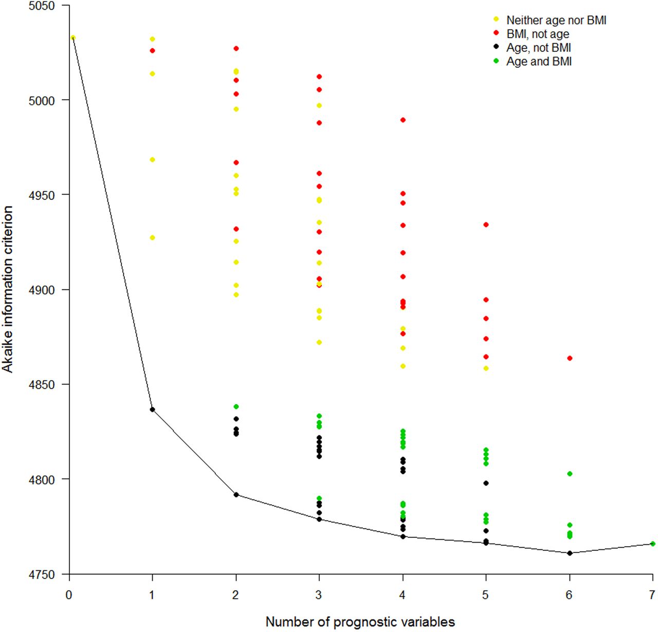
Goodness-of-fit plot for all possible prediction models. Akaike information criterion (AIC) for all possible models (disregarding potential transformations and interactions) employing none, any or all of the seven selected risk factors. A lower AIC indicates a better fit. Cox models were used. Results are presented in columns defined by the number of variables in the model. The first column shows the AIC for the model with no variables and the last shows the AIC for the model with all seven variables. The model content relating to two of the risk factors is highlighted: age and body mass index (BMI). Different colours are used to show the AIC for all models that include: neither age nor BMI, BMI but not age, age but not BMI, and both BMI and age. Otherwise no specific risk factors are identified in this particular plot.
Having selected our variables, one should consider whether interactions between them are important. Interactions are best dealt with by traditional significance testing. Sometimes an a priori decision will have been made to produce stratified results; for example, ASSIGN has separate scores for women and men.4 Such separation can be achieved by fitting a single prediction model with interactions between sex and all other variables.
Step 4: formulating the risk score
Once the important prognostic variables have been selected, the risk score is computed as a function of the weighted sum of these variables, where the weights are the regression coefficients from the multiple regression model (log odds ratios (ORs) for logistic models and log HRs for Cox and Weibull models).17–19 The only other decision needed is the time lag to be imposed upon risk prediction: as in ASSIGN, we will assume 10 years.
Risk is defined, mathematically, as a probability and thus takes values between 0 and 1; in cardiology, it is more common to see it defined in the equivalent range of 0%–100%. The risk score from the Glasgow data is given in box 1.
Risk score from Scottish Heart Health Extended Cohort study data on Glaswegian women
The estimated 10-year risk of cardiovascular disease is

where  =0.939601,
w=0.0674338 (age−48.48631)+0.131075(TC−6.119344)+(−0.3576948) (HDLC−1.513783)+0.0096177(SBP−129.5398)+0.8807747 (diabetes−0.013907)+0.7006343(smoker −0.4358974),
diabetes=1 if the woman has diabetes and 0 otherwise,
smoker=1 if the woman smokes and 0 otherwise.
Multiply by 100 to obtain percentage risk scores.
This was derived from the best Cox model identified in figure 3.
HDLC, high-density lipoprotein-cholesterol; SBP, systolic blood pressure; TC, total cholesterol.
Step 5: evaluating the risk score
Discrimination
Deciding how well the score performs in predicting who will and who will not get CVD (so-called discrimination) is complex, since the score only gives a likelihood of someone having CVD, typically on a scale of 0%–100%. The reality is that one either gets it or not, within the next 10 years. One might impose a clinical threshold, such as a 10-year risk of 10%, and see how well the score performs in relation to this. For simplicity, let us suppose that a logistic model is used. Then performance can be tested in terms of sensitivity and specificity.17 As with risk, sensitivity and specificity are strictly defined in the range 0–1, but in practice are often expressed as percentages. For example, table 1 shows the sensitivity and specificity of the logistic risk score we have produced from our data on Glaswegian women, using the variables of the best model from figure 3, where we have treated every woman censored before the 10-year cut-off as a negative outcome for CVD. Neither sensitivity nor specificity is very strong, but this may be expected because risk factor distributions of those with and without CVD overlap.
Performance of a clinical decision rule where those with a 10% or greater 10-year cardiovascular risk are considered positive for CVD (ie, at a high enough risk to require treatment, such as with statins): Glaswegian women in SHHEC
However, instead of restricting to one threshold, it would be preferable to judge the utility of the score across many thresholds. This is conventionally done by (in theory) producing tables such as table 1 for every possible threshold within the observed data. That is, each woman has a unique percentage risk score and one can use each such risk score to compute sensitivity and specificity, just as we did for 10% in table 1. In practice, it could be that some people have the same risk score, but the principle remains the same. The set of such sensitivity/specificity pairs is then plotted as a receiver operating characteristic (ROC) curve,17 ,29 such as figure 4. Note that the x axis is ‘one minus specificity’ (expressed here as a percentage).

Receiver operating characteristic curve showing results for two selected models, applied to the testing cohort. Sensitivity versus one minus specificity plotted for every observed threshold, and expressed in percentage terms. Logistic models, applied to the data on Glaswegian women, were used to obtain the test results, which were then tested against the actual outcomes in the non-Glaswegian data. The two models illustrated in this plot are those that predict cardiovascular disease using (1) age as the single prognostic variable; (2) the model with the best (lowest) Akaike information criterion in figure 3; that is, using age, systolic blood pressure, total cholesterol, high-density lipoprotein-cholesterol, smoking and diabetes. AUC, area under the receiver operating characteristic curve.
If the two risk score distributions do not overlap, then one has an ideal tool because CVD and non-CVD cases would be perfectly discriminated. The ROC curve would, as the threshold increases, describe a line that runs from the bottom right, to the top right, to the top left of the plotting space. An ROC curve that is nearer to this ideal is, thus, a more discriminating score. The area under the ROC curve (AUC) is thus a sensible measure of discrimination, which is directly related to the correlation between the score and CVD disease status.17 ,30 Accordingly, the AUC is sometimes called the concordance statistic or ‘c-statistic’. The AUC is also the chance that, when two risk scores are compared, only one of which comes from someone with the outcome (CVD), the person with CVD will have the higher score.
On the other hand, if the risk score distributions for those with CVD and those without CVD overlap completely, sensitivity plus specificity will always be 100%, and the ROC curve would describe the diagonal dashed line—the line of ‘no concordance’ or ‘no discrimination’. Clearly, the c-statistic in this case would be 0.5. So a risk score that is, in any way, useful will have an ROC curve above the diagonal (with a c-statistic above 0.5).
Before interpreting figure 4, consider that any decision rule will routinely work best in the study population whence it was derived.9 ,12 This bias from self-testing can be avoided by using a so-called validation sample (a better name would be a ‘testing sample’). We have the luxury of using the non-Glaswegian portion (n=4440) of the female SHHEC database (conditionally sampled as for the Glasgow selection) as our testing sample. Unlike table 1, figure 4 was thus drawn by applying scores based on the Glasgow data to the non-Glasgow data; as in table 1, logistic models were used. Two ROC curves are shown, one for a score based on age alone (the best single risk factor in figure 3) and one for the risk score based on the overall best model, with all considered risk factors except BMI. There is considerable ‘daylight’ between the two, reflected by the difference in AUCs, which shows that the other variables do add substantial discrimination to age.
Unfortunately, the ROC curve and the AUC do not allow for censoring. Thus, when a survival model is appropriate, alternatives are needed. Harrell defined a survival c-statistic to be the chance that, when two risk scores are compared, only one of which comes from someone with the outcome (CVD), the person with CVD will have the shortest survival time.31 A good way to compare survival c-statistics is via a forest plot: figure 5 shows Harrell c-statistics for the ‘best’ models for each column in figure 3, in the testing sample. Notice that the c-statistic only measures discrimination, not GOF. It is thus not generally recommended to choose models through differences in c-statistics32 (which, themselves, might be usefully presented in a forest plot). Alternatives to evaluating changes in c-statistics are the integrated discrimination improvement and net reclassification improvement (NRI),33–35 which have intuitive interpretations when there is no, or insignificant, censoring. The version of NRI that includes thresholds is the most useful when evaluating the change from one risk model to another in relation to a clinical decision rule.

Forest plot showing survival c-statistics for selected models, applied to the testing cohort. Harrell's c-statistics (with 95% confidence interval) for the Cox models that have Akaike information criteria (AICs) at the base of each column (except the first) in figure 3, that is, models that have the best AIC for a given number of variables. Risk scores derived from these models were evaluated in the testing cohort of non-Glaswegian women. The variable list shown builds downwards, adding to the existing variables; for example, the c-statistic shown in the third row is for the model that comprises age, smoking status and body mass index, which is the model that gave the AIC at the base of the column labelled ‘3’ in figure 3. BMI, body mass index; HDLC, high-density lipoprotein-cholesterol; SBP, systolic blood pressure; TC, total cholesterol.
Calibration
Besides discrimination, the other important feature of a risk score is its calibration. Whereas discrimination, as outlined above, is a measure of how well the predictions line up in rank order, relative to outcomes, calibration measures how well key summary features of the risk score, such as its mean, compare with reality. Perfect calibration would be where all those with CVD have a risk score of unity (100%) and all those without have a risk score of zero. Generally speaking, CVD risk scores derived in one population have similar discrimination when applied in other populations,36 or in the same population several years later, but can have drastically different calibration.37 This is due to the, usually considerable, unexplained variability after any CVD risk prediction model has been applied.
It is impractical to expect anything like perfect calibration, but one can test for acceptable calibration through the Hosmer-Lemeshow test,5 ,17 ,38 which compares observed risks of CVD events from the raw data with those predicted (‘expected’) from the CVD risk score within the tenths (or other exclusive and exhaustive groupings) of the distribution of expected risks. To obtain expected values, one would take the mean values of the risk score within each of its tenths; the observed risks are simply the relative frequencies in each of the same 10 groups. Once again, this test is rather a blunt instrument due to its dependence on sample size, while a lack of agreement in a solitary tenth can cause rejection even when the score would generally give useful results in clinical practice.
A better approach is to use a calibration plot,17 which compares expected and observed risks on a square plot, as in figure 6 where the Glasgow score (box 1) is applied to the non-Glasgow testing sample. Clearly, calibration is poor since the score overestimates risk across the board. This is explained by the relatively socially deprived nature of certain parts of Glasgow, relative to the rest of the country. As noted earlier, the ASSIGN risk score4 dealt with the previously unaddressed issue, of social deprivation having a role to play in predicting CVD risk, by including a measure of it in the ASSIGN risk score. We deliberately omitted this in the example created for this article. Taking the SHHEC data as a whole, living in Glasgow had a significant adverse effect on CVD risk before, but not after, adjusting for social deprivation in both sexes. We would need to recalibrate17 our Glasgow score, should we wish to use it in other parts of Scotland.

Calibration plot, applied to the testing cohort. Expected risk (from the best model from figure 3: see box 1) versus the observed risk (relative frequency of cardiovascular disease events) in the testing cohort of non-Glaswegian women. Results are shown for the (approximately) equal number of women in each of the tenths of expected risk.
The calibration plot is superior to the compound bar chart, which is sometimes5 used for comparing expected and observed risk. This is because systematic patterns, which illustrate the lack of concordance between expected and observed risks, are easier to see on the calibration plot; multiple risk scores (eg, involving only clinic variables and involving both clinic and laboratory variables) can be directly compared on the calibration plot (especially if lines are drawn between adjacent points for each constituent score), and the bar chart cannot convey the distribution of the risk score, which is of fundamental importance.
Step 6: packaging and interpreting the risk score
Risk scores are often presented as ‘heat maps’, such as those from the European SCORE project,7 ,39 or using a points system40 which simplifies the underlying mathematical model so that points for each risk factor can be added up and summarised. Both give, however, only approximate results and in the modern age a much better way of presenting the score for general use is through a computer application, such as the web tool for ASSIGN.4 ,41 For motivational purposes, ‘vascular age’ might be defined from the risk score, and presented interactively.42 ,43
Finally, having got an acceptable risk score, it is useful to consider what it means in practice. To apply the score, one needs to decide on a threshold (or perhaps multiple thresholds) above which recommended care, such as statins, will be given. That is, a clinical decision rule is needed that is based on the score (as in table 1). A useful way of examining the effect of different thresholds is through a how-often-that-high graph44 (otherwise known as an inverse ogive), such as figure 7 which shows the distribution of ASSIGN scores in the SHHEC data from which ASSIGN was derived.4 This graph highlights the expected consequences (among women) of changing the current clinical decision rule in Scotland,45 which is to treat people, currently free of CVD, with statins at a 10-year risk of 20% or higher, to a new rule with a 10% threshold. The lower threshold is expected to lead to approximately one-fifth more women being treated within the total population, corresponding to roughly a tripling of the existing clinical workload (not accounting for those women with pre-existing CVD or women in other age groups). To put this in absolute terms, the right-hand axis scales up to the total number of women in Scotland free of CVD aged 30–74 years at the current time.46 Although SHHEC, based on risk factor surveys dating from 1984 to 1995, cannot reasonably be expected to represent contemporary Scotland, as a purely hypothetical example one can see that, if it did, this increase of 20% would lead to almost an extra 300 000 women being treated.

How-often-that-high graph showing anticipated effects of two different clinical prediction rules among Scottish women free of cardiovascular disease (CVD) and aged 30–74 years, based on the ASSIGN score in the Scottish Heart Health Extended Cohort (SHHEC) study population and contemporary Scottish demographic data. This shows (left axis) the expected percentage of women in Scotland, currently free of CVD, above a particular value of predicted 10-year cardiovascular risk, using the ASSIGN score applied to all the female data in SHHEC that were used to create ASSIGN, and the corresponding expected number in the Scottish population (right axis). The number of women free of CVD was estimated by down weighting the total number currently living in Scotland, aged 30–74 years,46 by the percentage in SHHEC with prevalent CVD.
Conclusions
Both clinical and statistical expertise are required to produce a clinical prediction rule. We have summarised the key steps involved in producing a useful rule, concentrating on the role of visual display to guide development, judge quality and draw conclusions. For greater insight, we encourage the reader to consult the citations provided. Code, for the R package, to carry out the analyses and produce the graphs for this article is given in the online supplementary material.
supplementary data
References
Footnotes
Contributors MW wrote the manuscript. HT-P and SAEP provided comments. SAEP wrote the R programs.
Competing interests MW is a consultant to Amgen.
Provenance and peer review Commissioned; internally peer reviewed.