Article Text

Abstract
Research is of little use if its results are not effectively communicated. Data visualised in tables (and graphs) are key components in any scientific report, but their design leaves much to be desired. This article focuses on table design, following two general principles: clear vision and clear understanding. Clear vision is achieved by maximising the signal to noise ratio. In a table, the signal is the data in the form of numbers, and the noise is the support structure necessary to interpret the numbers. Clear understanding is achieved when the story in the data is told effectively, through organisation of the data and use of text. These principles are illustrated by original and improved tables from recent publications. Two special cases are discussed separately: tables produced by the pharmaceutical industry (in clinical study reports and reports to data safety monitoring boards), and study flow diagrams as proposed by the Consolidated Standards of Reporting Trials and Preferred Reporting Items for Systematic Reviews and Meta-Analyses initiatives.
- Epidemiology
- Medical Education
- Statistics And Study Design
Statistics from Altmetric.com
Background
Effective communication of scientific data is arguably one of the most important skills of a scientist. If the intended audience does not get the message in the data (and acts on it), the research effort is wasted. Data visualisation in tables and graphs can convey complex relationships in a way unmatched by simple text. Good communication implies proper choices between body text, tables and graphs optimised for audience and setting. Wrong choices can lead to misinterpretation and wrong decisions.1
However, communication has traditionally received short thrift in scientific education, and it is not really stimulated by the parties responsible for dissemination of research: journals, scientific societies, etc. PhD programmes often have some sort of writing tutorage, but there, most time is spent on the body text. Guidance by editors in journals and conferences rarely goes beyond the description of sections, word count and limitation on the number of tables and figures.2 3 And finally, in my experience handling of tables and graphs has low priority in the production stage, often leading to suboptimal layout (size and placement of tables and figures in the text) and quality issues (especially loss of resolution, i.e. ‘fuzzy’ graphs and letters) that need to be corrected in the proofs.
It is therefore not surprising that the practice is at best mediocre. A review of articles submitted to BMJ concluded that less than half of the tables and figures met their data presentation potential.4 Also, external peer reviewers seldom commented on tables or figures.
The series: ‘Graphics and Statistics for Cardiology’ has previously featured articles on comparing categorical and continuous variables, survival analysis, data visualisation for meta-analysis and clinical prediction rules.5–8 This article focuses on effective table design. Most of the recommendations are based on sound design principles and tradition, informed by the science of human visual perception. There is little empirical evidence to support specific recommendations, so there is room for experimentation and innovation to see what works best. My own experience in data visualisation has been greatly inspired by three sources: Tufte, Cleveland and, specifically for tables, Few.9–11
General design principles
At the start of the design process, key questions to ask are: Who is the audience? What are my messages (to this audience)? Which of those need visualisation in a table or graph? And what would be the most effective form (for each of the messages)? Tables are best applied in situations where a considerable amount of exact/precise data needs to be reported, and the relationships between the data that need to be brought out are relatively simple.
Two design principles can be distinguished: clear vision and clear understanding. Clear vision is about maximising the signal to noise ratio in the visualisation. The signal is the data ’ink', that is, all pixels in a graph, all numbers in a table that depict or represent data. The noise (’non-data ink') is all of the supporting elements. In a graph, these include the axes, titles, labels, legends, etc. In a table, these include the supporting extra characters such as parentheses,'±' marks, headings, footers, grids, supporting lines (rules), etc. (figure 1).12

Names of table elements. The table, from a recent publication in Heart,12 is redesigned to display the available elements, not for optimal data communication.
Clear understanding is about telling the story in the data. This involves organising the data and optimising the use of text.
A practical issue is the choice of software. This is a big issue for graphs, but less so for tables. Most standard software packages perform adequately. Nevertheless, detailed knowledge is required to fine-tune and optimise the details.
Clear vision
Two main types of tables can be distinguished: the lookup table and the demonstration table. The former is intended to quickly find data associated with a label (like a telephone list). When required in a scientific report, such tables are usually simple in design, often lengthy and best placed in an online supplementary appendix. The demonstration table, like a graph, is used to bring out relationships in the data. The advantage of a demonstration table above a graph is the possibility to report in great precision, but the price is limited flexibility and interpretability.
Creating clear vision in a table involves the following steps: delineating rows and columns, arranging data, formatting text and summarising values where necessary.
Delineating rows and columns
Delineation means creating visual cues to guide the eye towards the most important groupings and comparisons. The message determines the kind of grouping, and the extent to which rows, columns or both need to be emphasised. In any case, a minimum of white space around a number is necessary for easy reading. Usually, the amount of white space is OK for the columns as their width is determined by the headings; for the rows, a rule of thumb is that the white space above and below a row should be equal to the height of the numbers in the row. Many journals have their own typesetting conventions that may or may not be good, but it is never wrong to submit your tables in a proper format. Extra emphasis (on rows or columns) can be achieved by a very light background fill; stronger emphasis is achieved by a thin rule (horizontal below a row or vertical to the right of a column). Fills and rules are supporting elements, non-data ink. Thus, they should be as light and thin as possible to avoid obscuring the data. For that reason, grids (figure 1) are best avoided (too much non-data ink).
Arranging data
The arrangement of data should facilitate the main comparisons for the message, and follow what the reader expects. Numbers are best compared when they are close together, and a horizontal comparison is slightly easier than a vertical comparison. We read from left to right, so we expect to see source data on the left and calculated results on the right, and time series that run from left to right. In contrast, we expect ranked data to be ordered vertically, usually from highest to lowest. Where the table needs to break (eg, across a page), we expect this to be at a logical point (eg, not in the middle of a category), and we need clear header and footer labels to remain oriented. These principles can be challenging in the face of space limitations: especially the horizontal space on a page or a slide presents a barrier, so a set of categories with long headings (many letters), or a large number of categories can be too wide for the page or slide. Creative tinkering with headings (eg, multiple header rows with progressively indented headings) and column widths can sometimes help. Splitting a table between columns is rarely a good idea, and in such cases, a vertical orientation should be considered. The only exception is when the table can be printed on two adjacent and facing pages, as in an open book.
The sequence for the data is also a design issue. Numbers, dates and times are always sorted in ascending or descending order. However, named categories need thought to achieve a sequence that is most meaningful in light of the message. For sure, the ordering is almost never alphabetical, unless the table is a lookup table.
Formatting text
Text formatting has several components. First, precision is important: in the body text, tables and figures. Precision should match the purpose (or message): in bookkeeping, cents add up to euros, and rounding can create noticeable errors. In statistical reports, there is a convention to report the mean of a variable with one decimal added to the precision in the source, and the SD with two decimals added. These conventions are followed without question in many clinical study reports produced by industry, with huge impact on readability (see further comments on the format of clinical study reports under ’special cases' below). High precision is mostly irrelevant in the interpretation of scientific data. In most cases, two or three significant numbers are amply sufficient to interpret the message in the data. And the differences or changes that we need to detect (because they are clinically relevant) are usually much larger than those detectable in the source. So, for example, even though a lab can measure alkaline phosphatase in blood with one decimal precision, clinicians are interested in changes of 20 points or more. Likewise, percentages can almost always be reported as integer. Linked to precision is the choice of numeric format that may differ between countries: dates, decimal point or comma and thousands separator.
Second, vertical alignment is important. Unfortunately, existing conventions are usually ignored in scientific tables. Numbers are best right aligned, and decimally aligned when there are decimals. Text and dates are best left aligned, and one date format should be chosen so that like numbers match up vertically. Centre alignment is reserved only for special cases, such as a long header label and a single digit or character in the column cells (eg, header ’response' and cell entry ’y' or ’n'). Note that for optimum readability, supporting characters such as the minus sign or parentheses should not be the alignment character, unless this character is present in all cells being aligned.
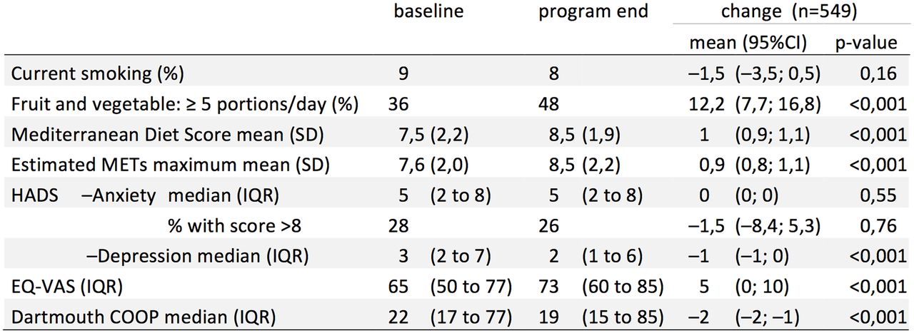
Apart from ignorance, there are several real problems that preclude effortless application of these conventions in scientific tables. The first problem is that scientific tables often contain categories with different kinds of variables, each with their own numeric precision and precision estimator. figure 1 shows a table that reports on results of variables as counts, percentages, ORs and their CIs in one row. Frequently, such variables (with different types of results) are listed below each other in one column (figure 2).13

Example of a recent table from Heart.13 The table suffers from poor readability due to multi-item cell entries and simple left alignment, suboptimal headings, overly high precision.
The second problem is that table cells often contain multiple entries. In figure 1, each entry is in its own cell, but we often see a precision estimator (SE, SD, IQR, CI) placed to the right of the point estimate, each with its own set of explanatory symbols: parentheses, hyphens, and the '±' sign (figure 2).
This creates clutter that degrades readability and obscures the message. The third problem is that for ranges—containing two numbers—alignment is not straightforward. For all these problems, the solution most frequently applied is to simply left align or centre the data in each column. This creates columns that look the same without improving readability (figure 2).
I have been working on the alignment problem for quite a while, and offer several possible solutions, none of them perfect. These comprise:
Placing each element in its own column, as the authors of the example table have done (figure 1).
This makes alignment easier, and allows deletion of non-data ink, that is, the parentheses as separator, but only works well if the cell elements are the same down the column. Also, the alignment of ranges remains a problem if the type of precision estimator is not constant down the column.
Fully disentangling all elements and properly aligning each separately (figure 3).
This works but can create large gaps when the precision of the numbers in ranges differs a lot.
Placing precision estimators below the point estimate (figure 4).
This improves horizontal comparisons by removing the intervening precision numbers but increases the vertical table size.
Properly (decimally) aligning the main number/point estimate, inserting white space and then left aligning the precision estimate (figure 5).
For long tables, this may be the best in terms of current practice.
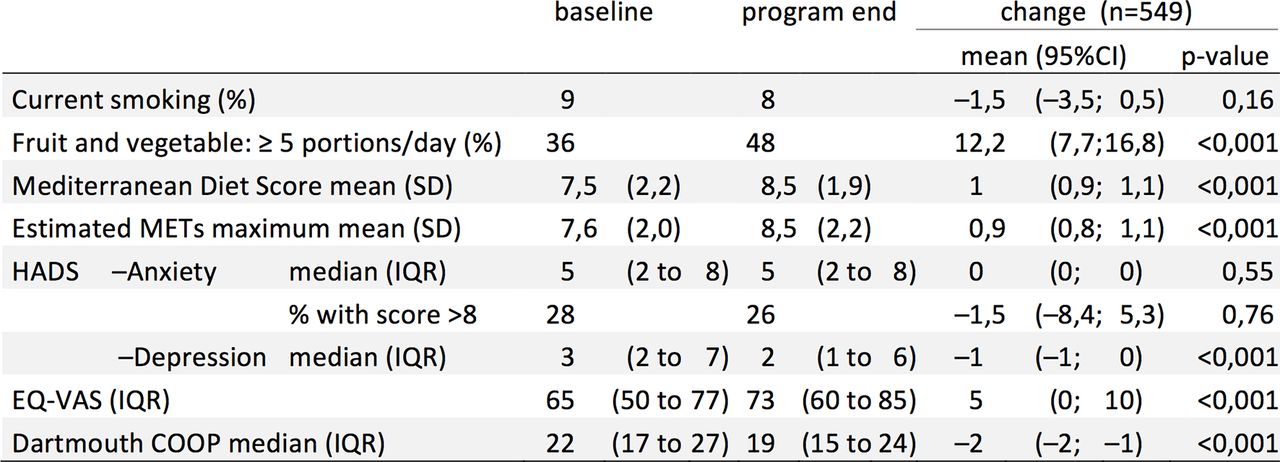
New design: precision estimators comprising single numbers (eg, SD) remain on the right of the point estimate, but those comprising two numbers (range, CI) are placed on either side, in a smaller font (figure 6).
This results in better horizontal comparison, places the point estimate appropriately between the range limits and increases the prominence of the point estimate. Table length is unaltered. Disadvantages include longer design time and readers and editors unaccustomed to this format.

Figure 2 data (excerpt); improvement of headers and precision; single item per cell; proper alignment. Decimal points were changed to commas because of software localisation issues: the decimal separator character is a comma in the Dutch localisation of the word processor software.

Figure 2 data: precision estimators below point estimate. Better horizontal comparison, but table becomes longer.

Figure 2 data: point estimator decimally aligned; precision estimators left aligned. In this case, little change from figure 3, overall slightly less wide.
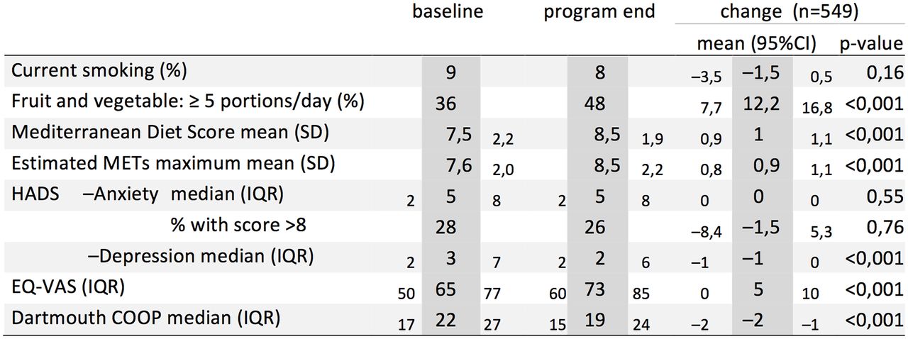
Figure 2 data: novel design. Lower range precision estimator placed on the left of the point estimator. To de-emphasise the precision estimators, they are produced in a smaller font and offset slightly below the point estimators. Point estimate columns are emphasised through extra shading.
Choice of fonts
For publication, most journals have their own style and will not allow you to choose. However, in reports published under your control (eg, study reports, theses) and in presentations, choices have to be made. Legibility is key. To start off: with current word processing and printing possibilities, there is *NO* excuse to choose a so-called ’non-proportional' font (figure 7).

Examples of font types. Proportional fonts have different widths depending on the character (eg, ’i' is narrow, but ’m' is wide). Serifs are the small vertical or horizontal lines placed at the end or beginning of a character line.
These fonts take up a lot of horizontal space (limiting the amount of data that will fit) and are not very readable. Such fonts resemble the good old typewriter font, where each letter required an equal width to fit on the typing hammer. An advantage of the non-proportional font was that columns could be aligned by inserting the correct number of spaces (as these had the same width as the letters), a feature still used by some statistics packages such as SAS. However, horizontal formatting with spaces has been obsolete in word processing for a long time: it should always be done with the horizontal ruler (for line width, paragraph indents, etc.) and tabs. All output packages (including SAS) now have the option to work with tabs: these insert space on the typing line, from the end of an entry up to a specific point to the right. Tabs allow left, right, middle and decimal alignment. Use of non-proportional fonts is a huge problem in clinical study reports submitted to regulatory agencies and data safety monitoring boards (see below).
Another aspect of fonts is the presence or absence of ’serifs' (figure 7): these are the small horizontal and vertical stripes added to the ends of letters. Serifs make for better reading on a printed page, but work less well on computer and presentation screens. And even in printed material where serif fonts are the rule, ’sans-serif' is often applied to tables. The choice for serif or sans serif should be made with these considerations in mind. Finally, some proportional fonts (eg, Corbel, Candara) are also proportional for numbers, for example, the '1' takes up less space than the '3'. Although this is OK for numbers placed in text and simple tables, such fonts are best avoided in complex tables because their use interferes with the vertical alignment.
Emphasis order
Clear vision also involves choosing the right cues for emphasis. For printed publications, the order (starting with most important) is bold, italic, font and colour (colour printing can incur extra costs). For presentations, the order is colour, bold, font (italics work less well on screen). Choice of colour is beyond the scope of this article, but as a general guide, colours should be muted and, if possible, respect the challenges faced by colour-blind people. For further guidance and a special palette of colours, see Okabe et al.14 Alternatives include an extra border around important data (in colour on presentation), larger font size and colour intensity.
Clear understanding
For the reader to understand the message in the data a story must be visible in the table. This means organising the data and optimising the supporting text (table title, category labels, footers). Organising the data involves grouping, prioritising and sequencing.
First, the data must be grouped into meaningful subsets, both in the horizontal and vertical direction. The choice for what goes vertical and what goes horizontal follows the arranging conventions and space limitations outlined above, but is also strongly related to the message: for example, are we comparing two or more groups in multiple variables (groups in columns), or change over time (time points in columns)? Or are we ranking one or a few variables in multiple groups (variables in columns, groups in rows, ordered by most important variable)? And for each direction, meaningful subgroups may be formed: for example, two groups (columns), in each a baseline and end measurement (subcolumns). Or three categories of disease severity (rows), split by male/female (subrows).
Visual cues (taken from perception theory) are helpful to transmit the importance of the chosen grouping. Elements are seen as a group when they are close together, look similar, are enclosed, are continuous or when they are connected. For table layouts, this means judicious use of white space (column width, row height), indentation (rows), horizontal or vertical rules and use of font colour or background shading. Relations between adjacent columns or rows can be enforced by cues such as combining and centring text in header cells (’spanner headings'), supported by ’spanner rules' where necessary (figure 1).
Next, the data should be prioritised and highlighted by importance, employing the emphasis order presented above. Finally, the data should be sequenced in the right reading order: the story should unfold from left to right, and from top to bottom. When necessary, sequenced labels (1,2,3 or A,B,C.) can be used for extra emphasis. However, the sequence can also intentionally be disrupted to create extra emphasis, for example, by placing a total at the top row (or the leftmost column) of a table (in bold, properly labelled) rather than at the bottom or right.
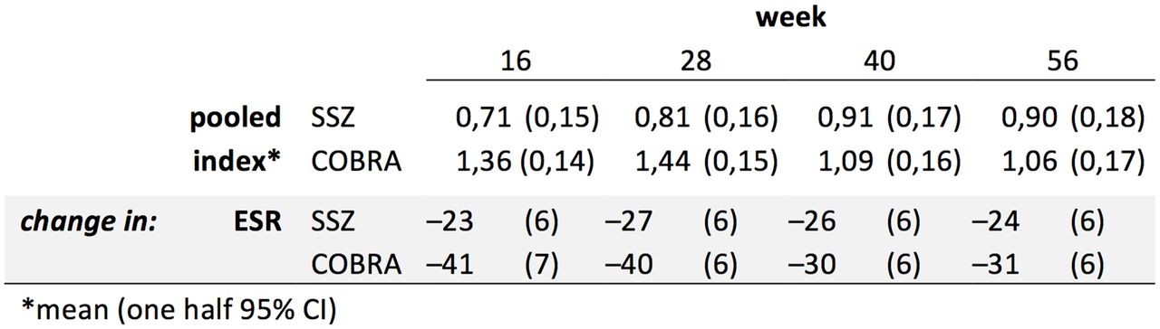
Figures 8 and 9 show the effects of choices made in vertical or horizontal organisation of the same data, a selection of results of a randomised trial in rheumatoid arthritis.15 In the vertical design, the treatment groups are in the columns, making this the main message. The means are on one row and the horizontal comparison is not hindered by the 95% CI because these are placed on the next row. Within-group change over time (placed in rows) is slightly more difficult to follow. In the horizontal design, change over time is placed in rows as the main message, and the groups are now placed as subcategory rows within each outcome variable. To reduce clutter, only the numerical value of one half of the 95% CI is shown.

Excerpt of trial data15: horizontal design.

Figure 8 data: vertical design.
Finally, the supporting text must be optimised for information content. Supporting text should introduce, explain, reinforce, highlight, sequence, inquire: all in service of the message. This applies to the title/caption, category (row/column) headers and subheader labels, footers, etc. The title should preferably summarise the data in the table (if journal style allows it). This certainly applies to the title of a presentation slide showing the table. Proper placement and choice of column width will allow the avoidance of abbreviations as much as possible (as these need to be explained in a footer), and in case of line breaks, phrases should be split at logical places: no automatic word wrap, but breaks where the reader naturally pauses.
Repeating text deserves special mention. This usually occurs where a main category is divided into subcategories. In this situation, the main category label is, for example, placed in one column, and the subcategory label in the next. For data sheets, for example, spreadsheets, cases (main category) are usually ordered in rows, and multiple observations in the same case (subcategories) fill subsequent rows. In this situation, the (sub)category information is needed in every cell of the column to properly identify the case, so the main label has to be repeated in every row, for every sublabel. However, when this is carried to a results table for publication, a special case of avoidable non-data ink emerges, because the repeating label carries no new information. Through continuity, the eye interprets all subcategories as a group even though the main label is only presented once, followed by empty space, or if the main label is centred across the sublabels (see the effect of redesigning the ’HADS' labels in the lower columns of Figures 2 and 3.
Special cases
Pharmaceutical clinical study reports and reports for data safety monitoring boards
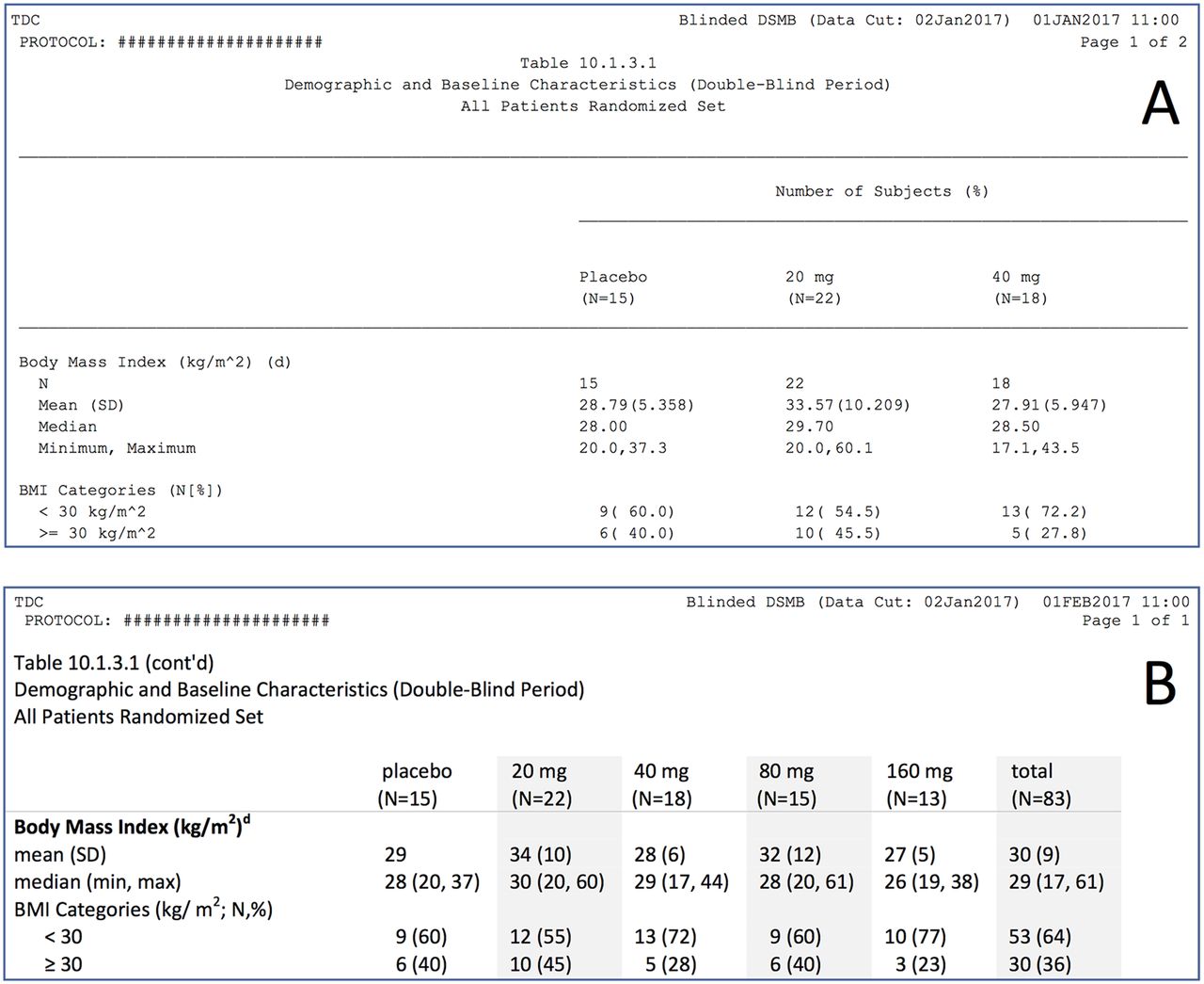
A clinical study report is a very important document: it contains a comprehensive description of a clinical trial submitted to the regulatory agencies, often in the context of the approval of a new drug. As such, it must conform to a lot of standards imposed by the agency. In some cases, a Data Safety Monitoring Board is instituted. This usually happens when the drug has a completely new mechanism of action, or when safety concerns have emerged from early trials or preclinical work. In both cases, typically, reports are generated that can contain hundreds of pages filled with poorly formatted tables (and figures). It is clear that such reports are a challenge to read, let alone to recognise safety patterns important to patients, thus possibly jeopardising the functioning of the safety board, and, ultimately, the study. As frequent member and chair of such data safety monitoring boards, I have been the unhappy ’consumer' of many such reports. Unfortunately, tradition holds strong both in industry and in regulatory agencies, and to date, I have been unsuccessful in my attempts to improve this situation.
The main problems of tables in pharmaceutical reports are excessive precision and use of non-proportional fonts. In addition, numbers are often poorly aligned, choice and placement of categories leave much to be desired, category labels directly transferred from the database are often poorly formulated and contain much redundancy, and much of the table ’real estate' is filled with uninformative repeating headers and footers. A fictitious example is excerpted in figure 10A, and shown in full in online supplementary appendix figure S1. Data and groups are imaginary, but categories, headers, footers and formatting are from a real report. The full table informs on four variables in five groups (plus a total column), split over two pages. In figure 10b and online supplementary figure S2, the same information has been placed on less than one page, and many improvements have been made by applying the principles elaborated in this article. The surface area of the original set of tables has been reduced from 823 to 281 cm2, a staggering reduction of 66%!

Excerpt of an example table from a Data Safety Monitoring Board report (fictional data): (A) Original formatting. Poor design including use of non-proportional font; issues with alignment, excessive precision, suboptimal category labels, wastage of vertical white space and unnecessary (repeating) footnotes that refer to other tables. The table requires two pages because only three data columns fit on one page. (B) Improved formatting, with the above issues corrected. The excerpt requires fewer rows, and all six data columns fit on one page. To see the original and set of improvements in full, see online supplementary appendix figures S1 and S2.
When confronted with these improvements, the chief statistician of the company I was dealing with commented: ‘nice, but we don’t have time to make pretty tables.’ And I now realise that this statement exactly encapsulates two different viewpoints: the statistician who is focused on making a table that presents a faithful and exact replica of the data in the database, that is, a lookup table, and the consumer (me) who expects a table optimising the presentation of messages in the data, that is, a demonstration table.
Flow diagrams for the ‘Consolidated Standards of Reporting Trials’ and ‘Preferred Reporting Items for Systematic Reviews and Meta-Analyses’
The guidelines formulated by the Consolidated Standards of Reporting Trials (CONSORT) and Preferred Reporting Items for Systematic Reviews and Meta-Analyses (PRISMA) initiatives have led to great improvements in the reporting of trials and systematic reviews, respectively,16 17 and the associated flow diagrams18 19 have become a mandatory feature in publications of trials and systematic reviews in major journals. These diagrams clarify patient and study disposition, respectively, in terms of inclusion, exclusion and for patients, premature discontinuation and dropout, complete with reasons. Unfortunately, the committees recommending these diagrams failed to include some basic formatting instructions, and the templates offered on their websites (and followed in this ‘graphics and statistics’ series7) are inadequate. As a result, most diagrams in publications suffer from all the woes of problematic tables: (repeating) text overload, alignment issues, excessive precision, suboptimal sequencing, etc. In addition, the drawing quality (lines, arrows, boxes) is often rudimentary. An example of these issues is shown in figure 11.20 Following the design guidelines given above, great improvements can be obtained (figure 12; online supplementary appendix figures S3–S6, including Word templates for personal use).

Example of a Preferred Reporting Items for Systematic Reviews and Meta-Analyses flow diagram (reprinted with permission20), suffering from poor or non-existent alignment, text redundancy, category switching, exaggerated precision and sloppy design of boxes and arrows.
Figure 11, improved.
Conclusion
Tables (and figures) are essential tools in the communication of the message, but receive too little attention in scientific reports and publications. Most common flaws are easily avoided by following design principles outlined in this article. Authors and editors should work together to improve data visualisation and stimulate innovation in design.
References
Footnotes
Competing interests None declared.
Provenance and peer review Commissioned; internally peer reviewed.