Article Text

Abstract
Graphical displays play a pivotal role in understanding data sets and disseminating results. For meta-analysis, they are instrumental in presenting findings from multiple studies. This report presents guidance to authors wishing to submit graphical displays as part of their meta-analysis to a clinical cardiology journal, such as Heart.
When using graphical displays for meta-analysis, we recommend the following:
Use a flow diagram to describe the number of studies returned from the initial search, the inclusion/exclusion criteria applied and the final number of studies used in the meta-analysis.
Present results from the meta-analysis using a figure that incorporates a forest plot and underlying (tabulated) statistics, including test for heterogeneity.
Use displays such as funnel plot (minimum 10 studies) and Galbraith plot to visually present distribution of effect sizes or associations in order to evaluate small-study effects and publication bias).
For meta-regression, the bubble plot is a useful display for assessing associations by study-level factors.
Final checks on graphs, such as appropriate use of axis scale, line pattern, text size and graph resolution, should always be performed.
Statistics from Altmetric.com
Background
Graphical displays are a powerful tool, which when presented with clarity can deliver key results to a wide audience. In the special case of collated data sets from several studies, as typically used in meta-analysis, the lucidity of graphical presentations can often be challenging.
In this report, we offer guidance to authors wishing to submit graphical displays as part of their meta-analysis to a clinical cardiology journal, such as Heart. The complexities and challenges of conducting meta-analysis itself have been well documented in a number of texts1–6 and are not the focus of these guidelines. Our aim is to provide a framework for consistent graphical reporting in the Heart journal.
Graphical displays for meta-analysis
A meta-analysis is typically based on the assumption that studies included in the analysis have the ‘same’ research question (or provide answer to the same question) and that estimates from individual studies are representative of an underlying true estimate. Providing evidence on this assumption and conveying results are critical to the analysis. For this, graphical displays play an important role in translating key findings to interpretable messages. However, care must be applied in building felicitous graphs. In poorly constructed graphs, the message will at best be confusing to the reader and at worst will be misinterpreted. In this section, we list our choice of recommended graphs and provide guidance to help present key findings with clarity.
Flow diagram
The flow diagram is a common starting point in explaining which studies were initially identified for a systematic review and which of these were finally included in the meta-analysis. In reporting this process, as well as other items, the PRISMA (Preferred Reporting Items for Systematic Reviews and Meta-Analyses) Group has produced a flow diagram template. We endorse this structure of reporting and the use of the flow diagram. We present our recommendations in box 1 with example of the diagram in figure 1.
Building a flow diagram
The flow diagram comprises a box at the top of the diagram that shows the number of records initially searched, a box at the bottom of the diagram that reports the number of studies selected for the meta-analysis and intermediary boxes placed in between that show the steps taken to arrive at that selection.
Boxes can be grouped into four phases in the diagram: identification, screening, eligibility and included.
Downward arrows between boxes show the ‘flow’ of the study selection and arrows to the side show exclusions made at each step. Exclusions should be reported with number and reasons for the exclusion.
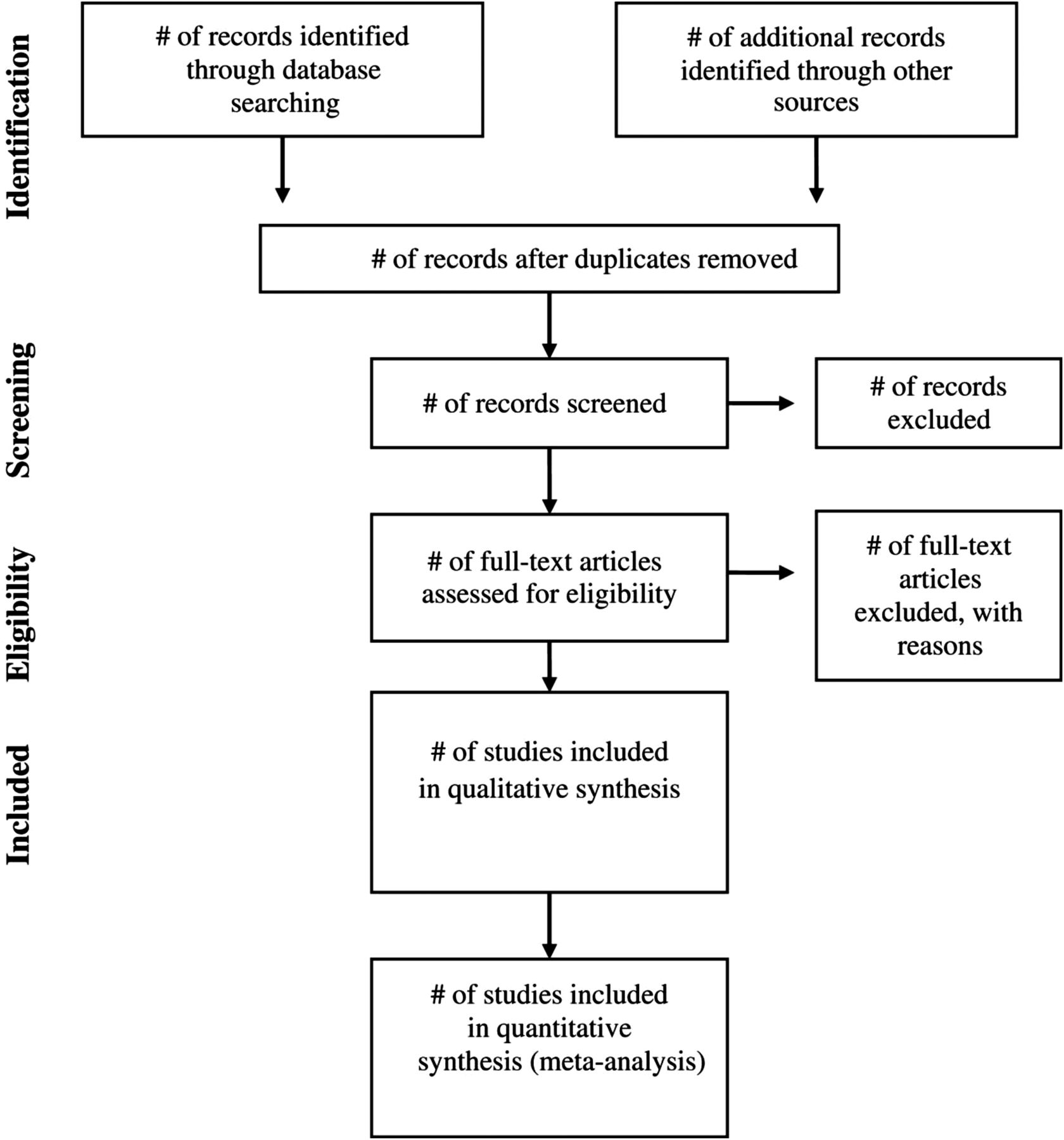
PRISMA (Preferred Reporting Items for Systematic Reviews and Meta-Analyses) 2009 flow diagram.7
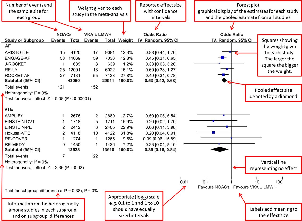
Figures incorporating a forest plot
The most widely used and familiar graphical displays for meta-analysis are figures that comprise tabulated statistics and forest plots. The origin of this plot dates back to the 1970s with rumour that the name was subsequently adopted because of its forest of lines.8 In this figure, readers are able see the parameter estimate of each study and the overall pooled estimate. The figure is a data-rich display that needs to include a number of key points to be effective.
In the tabular section, studies are listed with the number of events observed (or some measure of effect when outcomes are continuous) and the sample size. Studies should follow some logical order for their listing, for example, by date of study or study weight. The effect size reported in each study is usually given in terms of mean difference, OR, risk ratio, rate ratio or HR and is accompanied by the 95% CI. Studies with small SEs around their parameter estimates, compared with studies with large SEs, have greater precision and are therefore given a larger weight when pooling effects. In fixed effects meta-analysis, where the same underlying effect is assumed, it is common to award study weights by the inverse of the variance. For random effects meta-analysis, where the true effect can differ across studies, the among study SD is added to the variance and then inverted.9 In addition to reporting these statistics, the heterogeneity among studies should also be reported. We encourage using the I2 statistic as recommended by the Cochrane Collaboration.10
For subgroup analyses, tabular sections (and corresponding forest plots) should be presented and labelled for each subgroup. Differences in effect sizes or strength of associations between study subgroups can be tested using the I2 statistic. In cases when there is no statistical evidence that the estimates differ between subgroups (ie, the test for interaction is not significant), it is inappropriate to take the subgroup results as stand-alone results. In such cases, the overall estimate is the best estimate of an effect across subgroups.10
In the forest plot, the estimate sizes for each study (square) with 95% CI (horizontal line) are shown. The weight of each study is represented by the size (area) of the square, which can sometimes be larger than the CI. Using all the studies, an overall pooled estimate size is shown at the bottom of each plot or subplot. This is depicted by a diamond to distinguish it from the individual studies with squares; the left and right vertices of the diamond represent the lower and upper 95% CI, respectively. We present our recommendations in box 2 with an annotated example in figure 2.
Building a figure incorporating a forest plot
Tabular section
List the studies in the meta-analysis. Studies should follow some logical order for their listing, for example, by surname, weight or year of publication.
Report the number of events (or other relevant estimates) for each study group.
Provide the corresponding sample size for each study group.
State the weight (contribution) of each study in the meta-analysis.
For each study, report the parameter estimate and 95% CI.
At the bottom of each tabulated section, report total or subtotal and the I2 statistic for heterogeneity among the studies.
Forest plot
For each study, display the parameter estimate using a square, with a horizontal line for the 95% CI.
Represent the weight of each study in the analysis by the size of the square—larger weights have larger squares.
Show the overall pooled estimate at the bottom of each (sub)plot using a diamond; the left and right vertices of the diamond should represent the lower and upper 95% CI, respectively.

Example of a forest plot: forest plot of fatal bleeding incidence in comparison with controls according to condition.11
Displays for the evaluation of small study biases
Graphical displays that show present distribution of estimate sizes by the power of the study can help identify potential publication bias. The funnel plot and Galbraith plot are popular displays and are often presented as a supporting figure to the forest plot.
The funnel plot is a scatter plot, where each dot represents an individual study and is positioned according to its effect size or strength of association (x-axis) and the precision around its estimate (y-axis). We recommend using SE as a marker for precision which also incorporates the size of the study.12 The construction of the funnel is done using three lines, a vertical line that shows the summary parameter point estimate and two diagonal lines (funnel) that show the 95% CI. A reversed (y-axis) scale can be used to place the larger studies towards the top of the plot. For ratio measures, a log scale should be used.10 As the SE increases, the distance between the funnel lines increases. If the funnel plot is asymmetric, this can indicate publication bias. In the absence of both heterogeneity and publication bias, we would statistically expect 5% of studies (1 in 20) to lie outside of this region. Funnel plots with <10 studies should be interpreted with great care and are not recommended.9 ,13 We present our recommendations for producing funnel plots in box 3 with an annotated example in figure 3A.
Building the funnel plot
X-axis: report the parameter estimate using a log scale for mean difference, OR, risk ratio, rate ratio and HR.
Y-axis: use SE as a marker for precision.
Dots: each dot, of equal size, represents a study (minimum 10). Choose suitably sized dots to allow readers to see each study.
Funnel: the funnel has three lines, a vertical line showing the summary parameter point estimate across studies and two diagonal (funnel) lines that represent the 95%CI.

The Galbraith plot is a scatter plot, where each dot represents an individual study and is positioned according to its standardised estimate size (y-axis) and the precision around it (x-axis). We recommend using inverse SE,9 which takes account of the size of the study. The construction of the plot is done using three lines, the unweighted (fixed effects) regression line that passes through the origin and two parallel lines that define the region of the 95% CI. In the absence of both heterogeneity and publication bias, and under a fixed effects model, we would statistically expect 5% of studies (1 in 20) to lie outside of this region. The extent of heterogeneity is shown by the vertical scatter of points, with estimates near the origin being less precise than those further away from the origin.9 We present our recommendations for producing Galbraith plots in box 4 with an annotated example in figure 3B.
Building the Galbraith plot
X-axis: use inverse SE as the proxy measure of study size.
Y-axis: report the standardised parameter estimates.
Dots: each dot, of equal size, represents a study. Choose suitably sized dots to allow readers to see each study.
Slope: the plot has three lines, the unweighted (fixed effects) regression line that passes through the origin and two parallel lines that define the region of the 95% CI.
Furthermore, in assessing risk of bias in included studies, reviewers should consider the empirical evidence of bias, likely direction of bias and likely magnitude of bias, and wherever appropriate use a graphical display as recommended by the Cochrane Collaboration.10
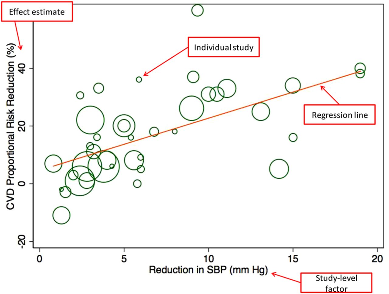
Meta-regression and the bubble plot
The heterogeneity among studies can sometimes be explained by a study-level factor. This can be investigated using meta-regression, where the association between parameter estimates of individual studies and the study-level factor is delineated. Visualising this relationship can be achieved using a meta-regression bubble plot. The graph is a scatter plot typically denoted by open circles, where each circle represents an individual study and is positioned according to study-level factor that is being investigated (x-axis) and its parameter estimate (y-axis). The size of the circle varies according to the weight given to parameter estimate. The formula for this weight should be described in the methods section, and typically has an inverse relationship with SE. For example, with inverse of within-study variance (fixed effects meta-analysis), larger circles represent greater precision. We present our recommendations for producing meta-regression plots in box 5 with an annotated example in figure 4.
Building the meta-regression plot
X-axis: report the study-level factor that is being investigated.
Y-axis: report the parameter estimate using an appropriate scale—linear scale for risk difference, log scale ratios.
Circles: each open circle represents a study. The size of the circle indicates the precision of the effect estimate and the weight given to that study.
Line: regression line of best fit.

Example of meta-regression plot: meta-regression plot of the percentage risk reduction in major cardiovascular disease (CVD) events regressed against the difference in achieved systolic blood pressure (SBP) between treatment arms.16
Final check for graphs
In this guidance document, we present recommended plots for displaying key findings of meta-analysis for Heart. It is important to note that there are alternative graphical displays that can be used for presenting findings, from simple summaries of effect estimates such as box whisker plots and violin plots to alternative displays for assessing heterogeneity such as the L'Abbe plot.9 ,15 At the authors discretion, these should be considered in addition to the recommended graphs in these guidelines. Heart allows the accompaniment of online supplementary material.
Graphical displays can be produced using a number of software packages. While we do not have a preference on the choice of software, we have personally found Stata and R to have an extensive suite of macros in support of meta-analysis, producing publication quality graphics.
Once graphical displays are produced, there are a few final checks that should be performed. Our recommendations on final checks are presented in box 6.
Final check on graphs
Axis scale and number of tick markers
The axis scale should cover the data points. The intervals chosen should be such that they aid the reader in understanding the impact of findings in the graph. Too many tick markers and the graph will be cluttered; too few and the graph may be hard to interpret.
Line pattern and colour
For graphs in greyscale, line patterns could be used to aid the impact of the message. For graphs in colour, the choice of colour or the gradients across one colour should be sufficiently distinguishable to readers.
Text size
The text size used throughout a plot should be large enough to be read without difficulty when printed at the size at which the graph is to be produced (recommended font size 8+ for most font types).
Resolution
The graph should be ideally vector based or be of high resolution (sufficiently sharp in quality) that key details in the plot can be distinctly observed (in both online versions and in print).
Axes titles
It is vital to inform the reader what the graph displays. Y-axis and x-axis titles should make sense to the wider readership of Heart and should define the units used in the plot.
References
Footnotes
Funding The authors thank National Institute for Health Research (NIHR) Oxford Biomedical Research Centre (AK, APC, KR) and the Oxford Martin School (KR) for funding this study.
Competing interests None.
Provenance and peer review Commissioned; externally peer reviewed.