Article Text

Abstract
Graphs are a standard tool for succinctly describing data, and play a crucial role supporting statistical analyses of that data. However, all too often, graphical display of data in submitted manuscripts is either inappropriate for the task at hand or poorly executed, requiring revision prior to publication. To assist authors, in this paper, we present several forms of graph, for data typically seen in Heart, including dot charts, violin plots, histograms and boxplots for quantitative data, and mosaic plots and bar charts for categorical data. Justification for using these specific plots is drawn from the literature on visual perception; we also provide software instruction and examples, using various popular packages.
Statistics from Altmetric.com
Introduction
Graphs are an excellent tool for communicating data to readers. Research in visual perception has shown their superiority over tables for communicating trends and differences.1 ,2 However, the choice of which graph to use, when communicating different data types and different aspects of a dataset, is often overlooked. In this paper, we describe appropriate use of graphs for manuscripts submitted to Heart. In addition to recommending particular types of graph, and giving software examples for producing these graphs, we describe why they are good choices—by which we aim to help authors communicate more successfully, via the ‘language’ of graphs.
In this paper, we consider graphs for single variables, and pairs of variables; different forms of graphs are also appropriate for quantitative and continuous variables, as described in the following sections. All the examples are drawn from the publicly vailable National Health and Nutrition Examination Survey (NHANES) 2003–2004 and 2005–2006 datasets,3 from which we have taken subsets of size n=30 (small), n=200 (medium) and n=1000 (large), sampled to reflect random sampling from the US population. Code for all the examples is provided at the authors’ website http://faculty.washington.edu/kenrice/heartgraphs/.
Graphs for display of single samples
The simplest form of graph we consider shows observations of a single variable, for example, biomarker values for multiple participants in a study. Graphs of these data will efficiently communicate the range and distribution of values, while reinforcing other summaries (eg, mean, median, sample size) that can be communicated more precisely in the text.
Quantitative (continuous) variables
To graph the values of a quantitative variable with small samples sizes (ie, n<30), we recommend use of dot charts, also known as strip charts or dot plots. An example is given in figure 1A. A dot chart plots the observed values on a single axis. When these values are all different, with this sample size, using empty circles as the plotting character enables readers to see the raw data underpinning nearby values, that overlap. Multiple filled circles would not permit this. When tied values are present, stacked dot charts (see figure 1B) clearly show the multiplicity of the tied values, by stacking them perpendicular to the axis.

Dot chart (A) and stacked dot chart (B) illustrating systolic blood pressure (BP) measurements of n=30 randomly selected National Health and Nutrition Examination Survey participants.
For sample sizes above n=50, issues of overlap will typically make dot charts impractical, either through near-overlapping points becoming obscured in a ‘cloud’ of points (figure 2A) or so much stacking occurring that plotting symbols become too small for easy reading (figure 2B). However, for modest samples sizes (ie, n between 50 and 200) stacked dot charts with ‘binned’ outcomes will often resolve these problems; an example is given in figure 2C. (‘Binning’ the data means replacing each value within each given interval (or ‘bin’) with the midpoint of that interval. In figure 2C, the bins are of width 1 mm Hg and are centred around integer values, so the process is equivalent to rounding the data to the nearest whole number.) For small and medium-sized datasets, dot charts are preferred over the more well-known boxplot or box-and-whisker plot,4 pp.39–43 as dot charts shows the actual data values, up to binning, rather than just a few quantiles plus the most extreme observations. This enables the readers to infer more aspects of the data. Specific aspects that are of particular interest (such as the reference values for the variables, of the sample mean or median, and related measures of uncertainty such as 95% confidence intervals) can be superimposed easily on dot charts. Figure 2C shows an example of a superimposed sample mean and corresponding confidence intervals.

Dot chart (A) stacked dot chart (B) and stacked dot chart with binned outcomes (C) illustrating systolic blood pressure (BP) measurements of n=200 randomly selected National Health and Nutrition Examination Survey participants. The sample mean and corresponding 95% is superimposed below the data on (C).
For still larger sample sizes, the problem of points being too small cannot be avoided. However, with such large sample sizes it becomes unlikely that individual values affect interpretation to any practically important extent, and so a direct representation of the range and distribution of the data may be sufficient. Various options are presented in figure 3; none of these methods have any restriction that the data should follow a particular form of distribution, for example the normal distribution.

Histogram (A) violin plot (B) and boxplot (C) illustrating systolic blood pressure (BP) measurements, of n=1000 randomly selected National Health and Nutrition Examination Survey participants. The sample mean and quartiles are superimposed in (B). The boxplot shows the same quartiles as a box, ‘whiskers’—denoting the most extreme data point which is no more than 1.5 times the IQR from the central box—and more extreme data points, which are plotted individually.
Figure 3A shows a histogram, in which bar heights above the x-axis correspond to the counts in each ‘bin’ of data, scaled to show density, that is, scaled so that the total area of the bar is one. Figure 3B shows the same data using a violin plot, in which the counts are smoothed, and density indicated by deviations both above and below the x-axis. Finally, figure 3C shows the same data using a boxplot. This is in the standard form, in which the central ‘box’ shows the 25, 50 and 75 percentiles of the data, the ‘whiskers’ extend to the last data points no more than 1.5 box-widths more extreme than the quantiles, and data points any more extreme than this are plotted individually.
These graphs all have strengths and weaknesses. Histograms and boxplots are traditional formats, while the violin plot is more recent and likely to be less familiar to readers. Histograms and violin plots can capture features in the middle of the data that the ‘box’ cannot; examples include multi-modality (see eg, figure 2 of Hintze and Nelson5) and other quantiles, for example, the tertiles, which can be approximated by finding the points at which the violin plot's or histograms's shaded region is split into three equal areas. Violin plots, showing the density above and below the x-axis, communicate the overall shape of the distribution slightly better than histograms, which may draw attention to the highest bars more than others.
Histograms and violin plots need to pay no special attention to data at the extremes, whereas the boxplot's individually plotted extreme points, as well as suffering from problems of overlap in large samples, often tend to be viewed as ‘outliers’ that are somehow suspicious. This is unfortunate, as these points will be observed, routinely6; for example, while sampling normally distributed data one would expect at least 30% of samples of any size to contain outliers, with this proportion rising rapidly to 100% in large samples. In other words, their presence is never truly surprising. Finally, violin plots and boxplots are more flexible formats than histograms, making it easier to use them when plotting data on a vertical axis. (Examples follow in figure 5.) The same flexibility helps when superimposing other information, such as the quantiles in figure 3B; indeed, software for producing violin plots adds these by default.7
Categorical variables
For categorical variables, such as sex, authors may well find that tables suffice for simple and concise recording of data, for example, number of men and women, proportions in each group and total sample size. However, if the information in the table is sufficiently important, communicating it graphically may be a better choice.
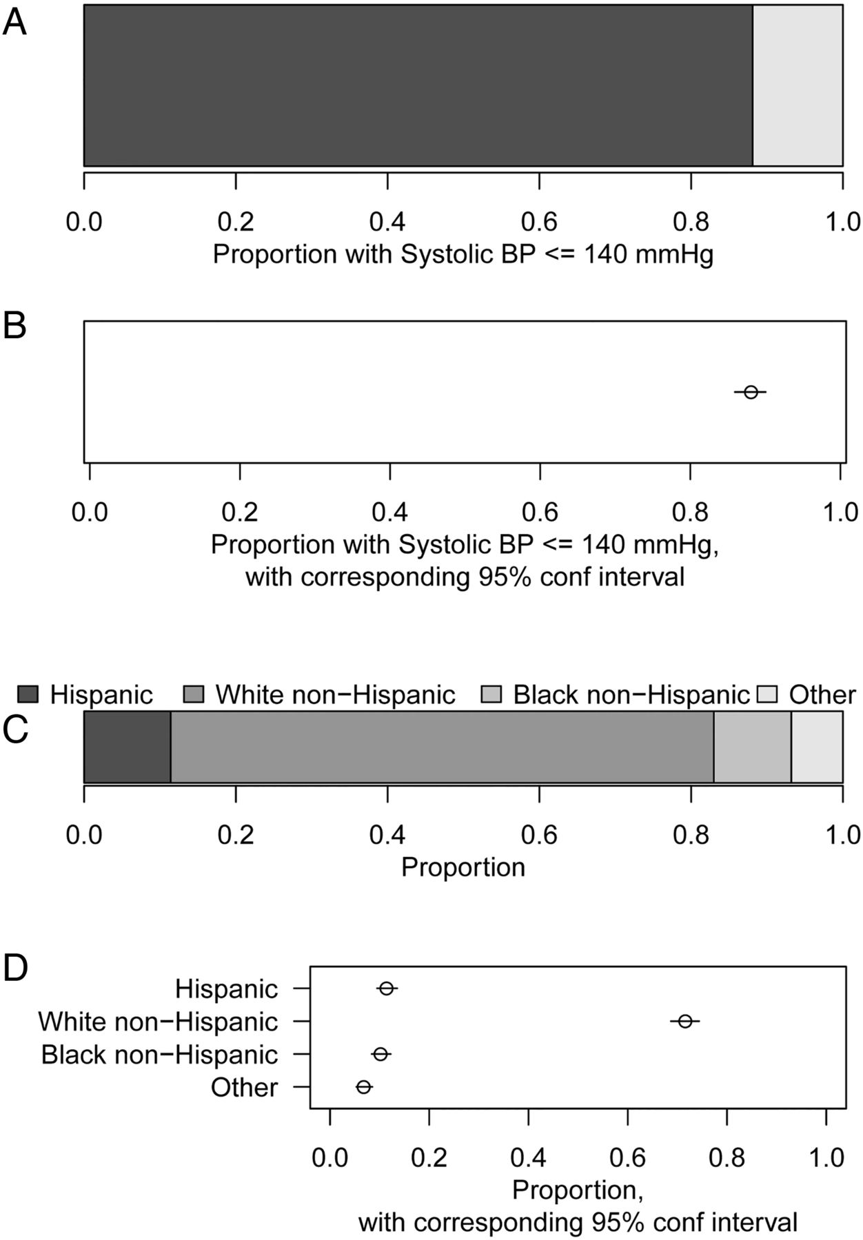
Regardless of sample size, for graphical presentations of binary variables (ie, categorical variables with only two levels, such as 1/0, or Yes/No or Alive/Dead) we recommend either a stacked bar chart or dot chart of proportion, as in figures 4A, B. For graphical presentations of categorical variables with three or more categories, we similarly recommend a stacked bar chart or dot chart of proportions, as in figure 4C, D. Particularly for the dot charts, using a proportion axis that extends all the way to zero will aid comparisons of absolute as well as relative proportions; standard bar charts (without stacking) achieve this, but with a more cluttered display than the dot chart, which is less conducive to having, for example, confidence intervals superimposed. When ordered categorical variables are presented, such as the underweight/normal/overweight/obese categories for body mass index (BMI), the proportions should be given in order.

Bar chart (A) and dot chart of proportion (B) illustrating proportion with systolic blood pressure (BP) measurements no more than 140 mm Hg of n=1000 randomly selected National Health and Nutrition Examination Survey participants. Stacked bar chart (C) and dot chart of proportions (D) for self-reported race-ethnicity, in the same participants are shown. The dot charts show 95% confidence intervals around each point estimate.
All of these graphs show the proportions in different groups (systolic blood pressure above/below 140 mm Hg or the four categories of race-ethnicity) as positions on a common scale, relative to a fixed references point. This is known to be an approach that helps readers assess the relative sizes of these proportions.8 The same principle is seen in a forest plot,9 which—like a multiple dot chart—displays data summaries from multiple subgroups on a common scale. The more familiar pie chart,10 instead encodes the proportions as angles, or equivalently ‘slice’ sizes; this is generally less effective for communicating the actual values of the proportions, and is not generally recommended. Pie charts may be more helpful when one graph is intended to communicate the sizes of combinations of two or more of the proportions, that is, two or more ‘slices’ put together.11
Graphs comparing two variables
Many of the principles for plotting single variables, such as use of position on a common scale, and basic tools such as dot plots, violin plots and stacked bar plots, can be adapted to communicate the relationship between two variables. The graphs typically show how the distribution of an ‘outcome’ or ‘dependent’ variable depends on a ‘predictor’ or ‘independent’ variable or ‘covariate’.12 Below, we describe recommended approaches for pairs of variables, with separate approaches depending on whether the variables are continuous or categorical.
Continuous versus categorical
For plotting a continuous outcome versus a categorical covariate, we recommend multiple dot charts, stacked dot charts and violin plots. Examples are given in figure 5A–C. These illustrate distributional information of the outcome of each group defined by levels of the outcome. Comparison across groups is enabled by plotting their data on the same common scale, that is, using the same y-axis. The sample size of each group is reflected naturally in the width of each stacked dot chart or violin plot. As in ‘Categorical variables’ section, when the categorical variable is ordered, the plot should respect this ordering.

Multiple dot chart (A) multiple binned stacked dot chart (B) and multiple violin plot (C) illustrating folate intake, respectively, of n=30, 200 and 1000 randomly selected National Health and Nutrition Examination Survey participants. Recommended daily allowances (RDAs) for pregnant women and other adults are superimposed on the violin plot.
As with plotting single groups, sample means, medians and other information can be superimposed on the results from each graph. These have a direct connection to the statistical analyses that are typically used to compare the groups; the t-test compares the means in two groups, and analysis of variance compares the mean across multiple groups; both procedures can be implemented directly given sample means for each group with corresponding 95% confidence intervals, and knowledge of the sample size in each group. We do not recommend that ‘stars’ indicating levels of statistical significance (eg, *for p<0.05, **for p<0.01, etc) are superimposed. These distract from direct comparison of the group means—which will usually be of more relevance to the underlying science than whether a somewhat arbitrary significance threshold is achieved. The use of stars is particularly problematic when many groups are being compared.
Continuous versus continuous
For plotting a continuous outcome against another continuous covariate, and for small or modest samples sizes, we recommend a scatterplot. Examples are given in figure 6A, B. As with the other recommended graphs, these code the information in the two variables as positions on common scales—the x-axis and y-axis. As with dot plots, we recommend that points are plotted using empty circle symbols, rather than filled circles, as the empty circles enable readers to better distinguish individual points when there are multiple points nearby. When observations are not unique (ie, when observations have identical X and Y values) then usually adding a small amount of random ‘jitter’13 to the points will make individual points distinguishable, while retaining the overall pattern of the original data. Where available, overplotting using transparent colours may also be effective.14
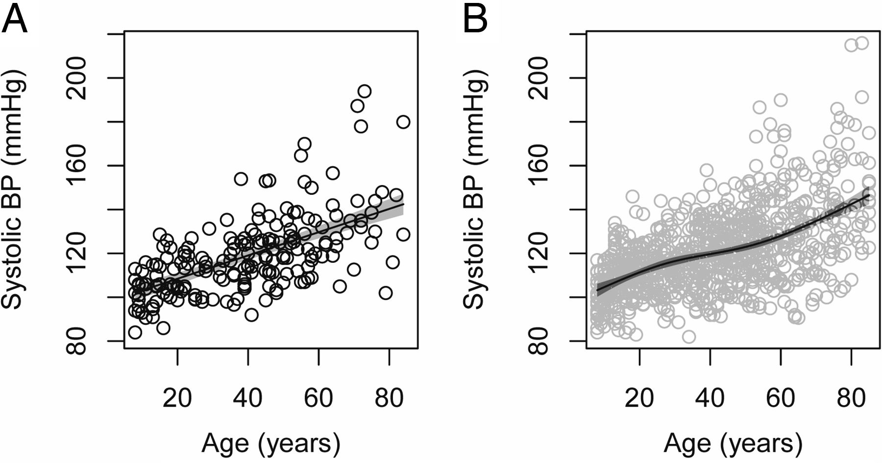
Scatterplot of systolic blood pressure (BP) versus age of (A) n=200 and (B) n=1000 randomly selected National Health and Nutrition Examination Survey participants. For n=200, the best-fitting linear slope is superimposed, surrounded at each point by a 95% confidence intervals. For n=1000, a flexible spline representation is instead used, allowing a more subtle signal to be observed.
As with earlier plots, relevant statistical summaries can be interpreted in terms of the graph, and superimposed on it. For example, linear regression of outcome on covariate (as in figure 6A) can be interpreted as finding the straight line through the graph that minimises the mean squared vertical distance from that line to the observed data points, ie, finding the ‘best-fitting line’. This line can be superimposed on the graph of the corresponding data, together with a region depicting 95% confidence intervals for its fitted value, ie, the fitted mean outcome, at each value on the x-axis. For small-to-moderate sample sizes, this analysis provides a pragmatic summary of increasing or decreasing ‘trend’ relationships, although this straight-line summary may be unhelpful if the true relationship is, for example, strongly U-shaped.15 For large sample sizes, the pragmatic choice to fit just a straight line is often less well-justified; a more flexible spline representation of the covariate16 can be fitted instead that can capture non-linear relationships between the mean outcome and the covariate. Point-wise 95% confidence intervals around this fitted curve can be added, as in figure 6B. An alternative to the use of splines is to ‘smooth’, (ie to average) the observed y-axis values near each position on the x-axis.17 This is in spirit close to regression with splines,18 but calculation of corresponding confidence intervals is more involved. (The confidence intervals around the fitted regression lines here use standard methods that assume there is identical variance of observations around the mean at each point on the x-axis.12)
Categorical versus categorical
As with single categorical variables, numeric tables (ie, contingency tables) may well suffice for describing the relationship between two categorical variables, for any sample size. Where graphics are needed, for plotting a categorical outcome with an intrinsic ordering against a categorical covariate, a natural graphical analogue of a contingency table is given by a mosaic plot, also known as a multiple stacked bar plot. An example is given in figure 7A. In this plot, the heights of the elements in each stacked bar indicate the proportions in each outcome category. However, as the widths of each stacked bar is proportional to the number of observations in its corresponding covariate category; the areas of the elements also indicate absolute counts, across covariate categories. Furthermore, because of the outcome's ordering, the horizontal boundaries in the stacked bars are at y-axis positions corresponding to cumulative proportions, within each covariate category.

Mosaic plot (A) and multiple dot chart of proportions (B) illustrating the categorised systolic blood pressure (BP) versus self-reported race-ethnicity of n=1000 randomly selected National Health and Nutrition Examination Survey participants. In (A), the width of each stacked bar represents the proportion of observations in that category; the height of each element within each bar similarly represents the relative proportion in that subcategory.
When the outcome has no intrinsic ordering, or where the ordering is not of interest, it may be preferable to use a multiple dot chart, as in figure 7B. In this plot, proportions in each outcome category can be compared within and between the covariate categories. However, this plot does not show the stacked bar chart's information about relative counts in each covariate category. As in ‘Categorical variables’ section, the same drawback applies to standard unstacked bar charts.
In a mosaic plot, the covariate and outcome play different roles, determining the width of the bars and the height within each bar, respectively. For situations where the graph is to illustrate the agreement or disagreement between two measures, this distinction is not appropriate, and we instead recommend a fluctuation diagram, as shown in figure 8. Here, the area of the square corresponding to each combination of covariate values is proportional to the count of that observation; the squares are also scaled to be as large as possible without overlapping. Patterns of asymmetry around the 45° line indicate disagreement between the covariates. For further discussion, see Hoffman19 and Unwin et al.20

Fluctuation diagram, comparing categorised first and second diastolic blood pressure (BP) measurements. Symmetry around the 45° line indicates no strong evidence of systematic differences between measurements, based on these data.
Unfortunately neither the mosaic plot nor fluctuation diagram can be modified easily to add CIs, point estimates or other summaries of the raw data. We recommend that these be reported in text or through separate graphs illustrating just the summaries and not the raw data.
Categorical versus continuous
For plotting a categorical outcome against a continuous covariate, we again consider different options when the outcome has two levels (ie, binary) versus having more levels. For a binary outcome, a standard scatterplot of outcome on covariate will show the data, although stacking or other adjustments may be needed to reduce overplotting of nearby or tied points. This may be a minor concern, however, when interest lies in the proportion of outcomes in either category, in different regions of the x-axis. This proportion can be shown on the scatterplot by superimposing the fitted mean from a logistic regression or similar analysis. An example is given in figure 9A. With larger datasets, using a spline representation of the covariate in regression analyses again adds flexibility, as shown in figure 9B, and this approach is again similar to adding a smoother to the scatterplot. As with the fitted summaries in figure 6, regions indicating point-wise 95% CIs can be added around these lines.

Simple logistic regression (A) and spline-based logistic regression (B) fit showing the relationship between dichotomised diastolic blood pressure (BP) and age of n=200 randomly selected National Health and Nutrition Examination Survey participants. The shaded regions indicate 95% CI around the fitted values, for each point on the x-axis.
With more than two categories, representing the outcome data on a single axis is not possible, so there is no straightforward way to plot all the data points individually. Dichotomising the outcome into ‘one category versus all the others’, one can plot multiple regression lines (or smoothers) indicating proportion in each outcome group, at different covariate levels; an example is shown in figure 10A. With careful annotation, this plot can be effective with up to five or six coloured lines, though we recommend no more than four if the graph is produced in black and white. Distinguishing between lines may also be difficult if, for the data being plotted, the lines are very close over large ranges of the x-axis. In ordered categories, this problem can be reduced by instead splitting the outcome into ‘upper categories versus lower’ for multiple cut-points; an example is shown in figure 10B. To aid interpretation, it may help to note that this plot is equivalent to splitting the data up by ranges of the covariate, giving a stacked bar plot of outcomes for each range and smoothing the resulting series of bar plots. Omitting the stacks and showing just the smoother is visually cleaner and can facilitate adding measures of uncertainty.
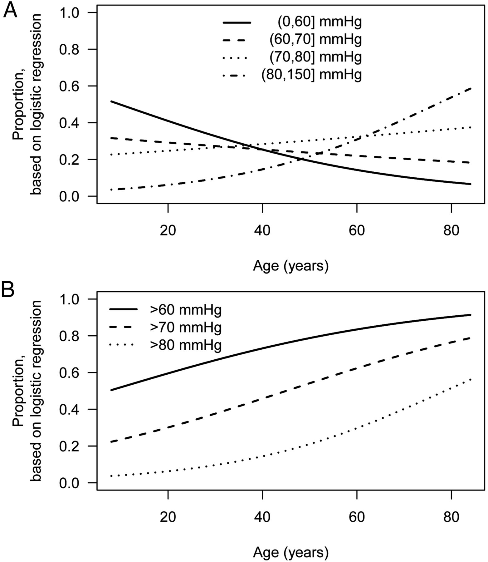
Plots showing fitted proportions, by age, of observations (A) in each unique category of diastolic blood pressure and (B) exceeding each specified threshold. In all cases, the fitted proportions are from logistic regression of binary outcome on age, using data from n=1000 randomly selected National Health and Nutrition Examination Survey participants.
Graphs illustrating more than two variables
To compare relationships between outcome and covariate at different levels of a third, stratifying, variable that takes only a few values, points and lines can be colour-coded by strata. To avoid printing in more than one colour, different plotting symbols (circles, squares, etc) and line types (solid, dashed, dotted) may also be used. Effective colour schemes for points can be found using the free ColorBrewer software,21 for both ordered and unordered stratifying variables. Guidance on which plotting symbols best distinguish multiple groups is given by Krzywinski and Wong.22 For different line types, few choices are typically available, with solid and dashed lines used predominantly. However, even with judicious choices of colours and symbols/line types, distinctions between more than four to five strata are likely to be difficult for the readers, and so the number of strata should be considered carefully by the authors, and kept to a minimum.
When showing how the relationship between continuous outcome and covariate depends on a third continuous variable, plotting in three dimensions becomes appealing, but this is naïve. As journal articles are necessarily printed on two-dimensional paper, without animation or stereoscopic techniques, the ‘depth’ of a three-dimensional plot cannot be communicated accurately. Techniques for providing visual clues to depth when comparing a handful of points on two-dimensional media are available23 but these cannot cope when displaying a full dataset, that is, when comparing multiple points. (Even with three-dimensional media, any benefit of three-dimensional graphics has been limited to a few specialised problems.24) Probably the most widely used form of simulated three-dimensional graphic is a stratified three-dimensional bar chart. These are hard to read accurately and can reproduce poorly in print. They can always be replaced by either a multiple dot chart or grouped bar chart, as illustrated in figure 11. This two-dimensional figure illustrates three variables: race/ethnicity, age, and hypertensive status; figure 11B additionally shows relevant CIs for the proportional hypertensive in each strata of age and race/ethnicity. If cumulative proportions are of interest a stacked bar chart may instead be appropriate, as in figure 4A; for full details of these plots for multiple variables, see Friendly.25

Proportion with systolic blood pressure (SBP) over 120 mm Hg, by age and race/ethnicity, using data from n=1000 randomly selected National Health and Nutrition Examination Survey participants. In (A), the proportions are given as bar heights and in (B) the proportions are given as single points. The simpler presentation in (B) leaves more flexibility to add corresponding 95% CIs.
Communicating still higher-dimensional data is possible, for example, by stratifying the data according to a third variable, and plot ‘small multiples’ 26 pg 67 of a scatterplot, with one subplot per strata. An example is given in figure 12, in which four variables are shown—blood pressure, BMI, age and sex. The idea of stratification can also be used for dot charts, violin plots and many other graphs, enabling an outcome/covariate relationship to be shown conditioned on values of one covariate, or two covariates if a grid of small multiples is used.

Small multiples of systolic blood pressure versus BMI, with sex-specific smoothers, conditioned on three age ranges. The plot uses data from n=1000 randomly-selected National Health and Nutrition Examination Survey (NHANES) participants; in this data the difference in blood pressure-BMI relationship by sex appears different in older participants.
Software and fine-tuning
The graphs in this paper have all been produced in R,27 a free and widely used statistical computing environment. Data and code to reproduce them is available on the authors’ website, http://faculty.washington.edu/kenrice/heartgraphs/. Several examples of the use of Stata and Excel to produce graphs of the same style, using the same data, are also available in the website. Regardless of which software is used in their production, the final production quality version of a graph will likely require that several details are considered.
Axes labels should be provided where necessary, with text that is legible at the size at which the graph is to be produced. For some variables it is common to use the data only after transformation (eg, log-transformation of gene expression). If the transformed units are familiar to the audience, these should be used throughout; if not, then a transformed axis should be used (eg, a logarithmic axis, for gene expression levels). If neither transformed nor untransformed are ubiquitous, both may be indicated, by using both left and right vertical axes, or upper and lower horizontal axes.
Similarly, legends should be provided, briefly explaining the meaning of different plotting symbols and any fill colours. Lines may be labelled directly, or described via a legend. If a plot has no free space for a legend, it may be plotted to the side of the figure, as in figures 4C and 7B. We do not recommend that information distinguishing lines, points and fill colours is provided in the caption below the figure; switching between the figure and the caption text distracts the reader. Captions, below the graph, can nevertheless provide useful information, for example on interpretation of the graph or its data source. In Heart's style, graphs are not supplied with titles; all explanatory text should appear in the caption.
A key consideration in fine-tuning a graph is considering the size at which it will be reproduced; much statistical software will automatically re-size axis labels and legend text depending on whether the graph will appear, for example, in a single column within the manuscript, or as a whole page. However, to take advantage of this re-sizing, authors must specify their figure's size. In the printed journal, a full page-width figure is 7.1 inches wide. On a 2-column page, a full column-width figure is 3.4 inches wide, while on a 3-column page it is 2.25 inches wide. In online supplementary material typical graphs will be full page-width.
Summary
Simple visualisation techniques can be used to enhance communication of scientific data; the choice of how to plot data is not just an issue of taste, house style, or simply accepting the literature default. For effective communication of the distribution of a variable, or showing relationships between pairs of variables, we have recommended plots that are straightforward, and can be produced in standard software. In manuscripts, poor graphs, as well as poor writing, hinder communication of findings, yet compared with running studies the time and resources required to improve them is often minimal. We therefore hope that the recommendations in this paper provide authors with a useful way to expedite publication of their scientific findings.
References
Footnotes
Contributors KR and TL devised the recommendations and implemented the examples. KR drafted the manuscript and web resources; TL advised on redrafting both manuscript and web resources
Competing interests None declared.
Provenance and peer review Commissioned; internally peer reviewed.
Data sharing statement All data are freely available to anyone—see manuscript for access details.