Article Text

Abstract
Reports of data in the medical literature frequently lack information needed to assess the validity and generalisability of study results. Some recommendations and standards for reporting have been developed over the last two decades, but few are available specifically for survival data. We provide recommendations for tabular and graphical representations of survival data. We argue that data and analytic software should be made available to promote reproducible research.
Statistics from Altmetric.com
Introduction
Over the last two decades a number of publications have focused on guidelines for reporting research findings in the medical literature. General guidelines are available in the form of publications,1 ,2 a book,3 and web-based resources.4 Survival data and data analyses have unique characteristics and challenges that are not well accounted for by typical graphing and analysis techniques.5 ,6 Some guidelines for reporting survival data are available, but they focus primarily on identifying reporting issues through literature searches.7–9 In this article we provide recommendations for graphical and tabular representation of survival data in the reporting of scientific data.
We give examples based on two publically available datasets. One represents 6800 patients enrolled in a randomised, double-blind, multicentre trial conducted in patients with congestive heart failure, but still in sinus rhythm, comparing all-cause mortality between Digoxin therapy and placebo.10 The other represents 4434 subjects enrolled in the long-term prospective study of the aetiology of cardiovascular disease in Framingham, Massachusetts.11 Our analyses of the Framingham data focus on time from enrolment to the combined outcome of first hospitalisation for myocardial infarction (MI), fatal coronary heart disease or death, and they exclude 86 individuals with prevalent MI at baseline. This results in a sample of 4348 individuals. Both datasets are made available by the National Heart, Lung, and Blood Institute for teaching purposes at https://biolincc.nhlbi.nih.gov/teaching/; they have been manipulated to protect patient confidentiality and are inappropriate as a source for subject-matter publications.
Special characteristics of survival data
Survival data give information about the time to the occurrence of an event. The event can be death, the onset of disease, or any other occurrence of scientific interest. We will use the term survival time even if the event is not death. Survival times are usually positive, and their distributions are rarely symmetric: there is often a small frequency of some high values. In biomedical studies, there are a number of common features of the way survival-time data are collected and the scientific questions that are asked of them that require specialised treatment when they are presented in tables or graphically. The most important of these are described in the paragraphs below. Example scientific questions that use survival data and analysis to determine the answers are ‘Does a new treatment lengthen survival times after a first myocardial infarction?’ and ‘How does exercise impact the risk of death in patients with chronic heart failure?’.
Event definition
A clearly defined event is crucial for the presentation of survival data. Examples of potential events are: (1) death from any cause, (2) disease progression, or (3) diagnosis with a specific disease. Answers to questions such as the following should be provided: How and by whom was progression defined and measured? Was death included? What were the diagnostic criteria? For readers to evaluate and judge generalisability of the study results and/or comparability to other studies, it is also important to describe how the outcome assessment was made (active follow-up, public records, medical records, self-report, etc).
Start time
Another crucial component of any survival analysis is the time at which the ‘clock starts’. We call this ‘time zero’: the time point that is most important in relation to the time at which the event under study occurs. In a clinical trial this is typically the time of randomisation. In observational studies this might be the time of enrolment into the study, birth, or another distinct event such as first MI, surgery or diagnosis with a specific disease.12
The definition of time zero must be chosen carefully. For randomised clinical trials with time zero equal to the time of randomisation and for sufficiently large samples, the randomisation ensures comparability of the treatment arms at time zero. Because the time variable used in plots and analyses is the time since time zero, time zero also defines all the times at which surviving subjects are assumed to be comparable. In an observational study, for example, subjects may be less comparable at any specific time since the beginning of observation/enrolment than they are at the time since some important reference time point such as the diagnosis that led to their entry into the study. For the interpretation of the graphs and summary statistics described in the next sections it is important that the definition of time zero be provided. For the remainder of this article we assume that all individuals are under observation in a study from time zero forward.
At risk
Subjects in a survival study are ‘at risk’ at any time point after time zero if they are alive and under observation and the event has not yet occurred at that time. Many graphical techniques and comparative methods for survival data are based on the proportion of subjects who experience the event of interest out of the number who are at risk at each time when an event occurs. Survival curves are estimated less precisely at times when few subjects are at risk, often near the end of follow-up.
Censoring
One very common feature of time-to-event data in biomedical studies is that the event of interest does not occur for all individuals while they are under observation. We may follow a cohort of diseased subjects to observe time to death, for example, but be required to stop collecting data before all cohort members have died. For some individuals we would have incomplete information about the time to event: we would know only that, if the event had occurred at all, it occurred after the last time we observed them. We call survival-time data like these ‘right-censored’. Typical summary statistics like means do not distinguish between right-censored observations and observations where the event of interest occurred while the participant was under observation. This means these methods are usually biased and/or less precise or powerful than is ideal when applied naively to censored survival data.
There are other types of censoring in addition to right censoring. ‘Interval censoring’ occurs when we do not know the exact time of event occurrence—for example, diabetes incidence—but we do know that it occurred between two known time points like the times of two follow-up visits. ‘Left censoring’ occurs when we know that the event under study has already occurred at the time we start observing a subject, but we do not know when (the event under study in this case cannot be death). In a study of ‘time to onset of diabetes’ prevalent cases of diabetes at enrolment would be considered left censored. In this manuscript, we will restrict consideration to the most common type of censoring, right censoring, and we will use the term ‘censored data’ to mean right censored data.
Many graphical and statistical approaches for censored survival data, and all those we discuss here, require the assumption that any censored observation is representative of subjects who are at risk of failure at the time the observation is censored. Statisticians call this ‘non-informative censoring’. Censoring is informative and graphs, estimates and comparisons may be biased if, for example, subjects who are close to death are more likely to drop out of a study than healthy subjects, since those who remain under observation will be less likely to die soon than the group of all subjects who survive beyond the time the observation was censored. In addition, if subjects who experience toxic effects of treatment are more likely to drop out of a clinical trial, treatment comparisons can also be biased.
A special form of right censoring is ‘administrative’ censoring. Administrative censoring occurs when a subject enters the study during an accrual period, but follow-up stops on a particular date and the event has not been observed by that date. Often, administrative censoring can be relied upon to be non-informative, since it is the design of the study and not subjects' individual attributes that determine when subjects are censored. However, if the characteristics of patients who enter the study early differ from those who enter later, administrative censoring can still be informative, and this can yield biased estimates and biased comparisons even if the informative censoring mechanism applies to different groups in the same (non-differential) way. A description of how censoring arose will help the reader decide whether censoring can be assumed to be non-informative.
Landmark analysis
For some studies it is of interest to compare groups which can be identified only after the observation period has started. An example is:13 comparing individuals who remain on an adjunct therapy for at least 6 months versus those who do not. A crucial characteristic in this setting is that the determination of which group an individual belongs to is not available at time zero, but is based on observations made only after the start of follow-up. Naïve analyses which use the group identification as if it were available at time zero consider individuals to be at risk as a group member at time points before they can be known/confirmed to belong to the group. This gives them unfair credit for surviving early times as a member of that group, because it ensures that they have to survive until the information on group membership is available. Patients who remain on an adjunct therapy for at least 6 months have to be alive for at least 6 months to fulfil this criterion, but patients who die within 6 months of enrolment would (in naïve analyses) be automatically counted as remaining on therapy for <6 months. As a result, comparisons between the groups are biased towards longer survival in the group who remains on therapy for at least 6 months. The bias of grouping patients based on characteristics/responses obtained after time zero has been well described.14
One approach to an unbiased analysis in this setting is to choose a ‘landmark’ time point: a clinically meaningful time (after time zero) at which group membership can be established. The comparison is then performed conditional on having survived to the landmark time point, and individuals who are censored or have the event occur before the landmark time point are excluded from the analysis.
As an example, the study by Eisenstein et al13 compared time to event in observational data on patients who received 6 (or 12) months of an antiplatelet regimen after receiving drug-eluting intracoronary stents. If times to event during the first 6 (or 12) months had been allowed to contribute to the comparison between the two groups, the 6 month group would have got credit for survival before they had received 6 months of antiplatelet therapy. Instead, the authors appropriately used landmark analysis at 6 (and 12) months, and events before those times were not counted in these analyses. The utility of this type of landmark analysis depends on whether or not the important clinical or scientific questions are answered by comparing future survival conditional on surviving to the landmark time. Certainly, the clinical question of which duration of adjunct therapy to plan for is not answered by this analysis. Unless there is specific scientific interest in comparing groups starting only at some time after time zero, we do not recommend the use of landmark analysis.
Tabular representations of survival data
For manuscripts presenting study results, table 1 typically provides summary statistics for participants' baseline characteristics tabulated by the main factor of interest. To describe the content of different groups for survival data, we recommend not only including the number of observations and percentages within each of the main groups, but also including the total time spent at risk (from study entry to the event or censoring) by subjects in the group. This provides the reader with a quantitative description of the extent of follow-up within important groups, which is often just as meaningful as the groups' sample sizes. An example table 1 for a few factors of interest is included here for the Framingham Heart Study.
Baseline factors by gender for time to first of any of the following three events: hospitalisation for myocardial infarction (MI), fatal coronary heart disease or death in the Framingham Heart Study
When presenting study results, a second table often provides summary statistics for the outcomes of interest. We provide example summary measures of survival and follow-up times in table 2 for both the Framingham Heart Study and the Digoxin trial. The most commonly presented summary measure for survival data is the median survival time: the estimated time point at which 50% of the study population has experienced the event. However, the median survival time cannot be estimated if >50% of the study population has not experienced the event and is still under observation at the end of the study observation period. For this reason, studies sometimes report estimates of a lower percentile of the survival times, such as the 25th.
Descriptive statistics for time to first hospitalisation for myocardial infarction (MI), fatal coronary heart disease or death by gender in the Framingham study and by treatment group for the Digoxin study
Another potential summary measure is the average survival time. Because of the censored observations, it cannot be calculated by simply averaging all participants' observed times from time zero to event or censoring, since a subject's censoring time is lower than his or her survival time. When the longest observation time is the time of an event, we can still compute an estimate of the mean survival time, since the data give us an estimated upper bound on the survival times. For example, if all but one patient in the Framingham Heart Study had experienced an event or been censored before 24 years of follow-up, and one individual had died (or experienced an event) exactly 24 years after enrolment, our observation that all subjects who survive as long as 24 years are very likely to die at that time provides evidence about the maximum survival time and allows us to estimate an average time to event in the study. When the longest observation time is a censoring time, as it truly is in the Framingham data, we know only that the last observed event time is guaranteed to occur after 24 years of follow-up, but not how long after 24 years. This is not enough information for us to be able to estimate an average time.
One possible option to estimate an average time to event is to make parametric assumptions about the distribution of the survival times. Another solution to this problem (that does not rely on distributional assumptions) is to estimate the mean of the survival times in a restricted (truncated) time interval, which usually underestimates the population average survival time. For example, in the Framingham Heart Study, the vast majority of patients are censored at 24 years of follow-up and the overall average time to event (first hospitalisation for MI, fatal coronary heart disease or death) restricted to the first 24 years for the Framingham Heart Study is 20.1 years (table 2); this can be interpreted as “among those in the Framingham Heart Study who had an event within the first 24 years, the average time to event is 20.1 years”. The average would be larger than 20.1 years if we considered a longer interval of time.
For survival data it is not only important to provide a summary measure of survival time, but also a summary measure of follow-up time, because incomplete and differential follow-up between the primary comparison groups can lead to informative censoring and bias, and this bias may be overlooked if no summary measure of follow-up (in addition to survival) is provided.15 Two proposed measures for summarising follow-up times (rather than survival times) are the median follow-up time based on censored observation times only and median follow-up time based on methods that take ‘censoring’ by the event occurring into account. Table 2 provides examples of survival and follow-up time summary measures for both the Framingham Heart Study and the Digoxin trial. It is noteworthy that the median follow-up times based on censored observations only are all 24 years for the Framingham Heart Study because >50% of censored subjects were still alive and under observation at 24 years of follow-up. In addition, 95% confidence intervals (95% CI) for these median follow-up times cannot be computed, because >98% of all censored observations had exactly the same follow-up time of 24 years. We recommend including at least one summary measure of the survival times and at least one summary measure of follow-up times.
Survival data graphs
Kaplan-Meier curve
For survival analysis the most common graphical representation of the data is the Kaplan-Meier curve.16 It depicts the survival experience of the study population by graphing an estimate of the probability of surviving beyond each time (vertical axis) versus time (horizontal axis). The estimate is designed to accommodate censored observations. The vertical axis of the graph typically ranges from 0 to 1. We believe that a plot of the Kaplan-Meier curve(s) usually is the most helpful graph to summarise the survival experience of one or more groups. Figure 1 depicts Kaplan-Meier curves for participants in the Framingham Heart Study who are <50 years old at enrolment by highest education achieved; plots on two different vertical scales are provided.

(A, B) Basic Kaplan-Meier survival plots of probability of avoiding hospitalisation for myocardial infarction (MI), fatal coronary heart disease and death versus time for participants under 50 years of age by highest education attained from the Framingham Heart Study using different vertical scales. ((A): scale 0 to 1; (B): scale 0.70 to 1). GED, General Educational Development; HSD, high school diploma.
It is difficult to see differences between survival curves for time from enrolment to first hospitalisation for MI, fatal coronary heart disease or death in figure 1A because the curves are close together; the vertical scale ranges from 0 to 1 and all survival curves for this group of participants remain above 0.70 for the entire observation period. To facilitate visual comparison, it can be helpful to truncate the vertical axis to show only those values that are attained by the curve(s) in either a survival curve (as in figure 1B), or a cumulative incidence curve (see ‘Cumulative incidence plot’ below). The disadvantage of this truncation is that the graph may overemphasise differences that are not clinically meaningful.17 Whenever possible and still informative, we recommend that Kaplan-Meier plots be depicted with a vertical scale of 0 to 1.
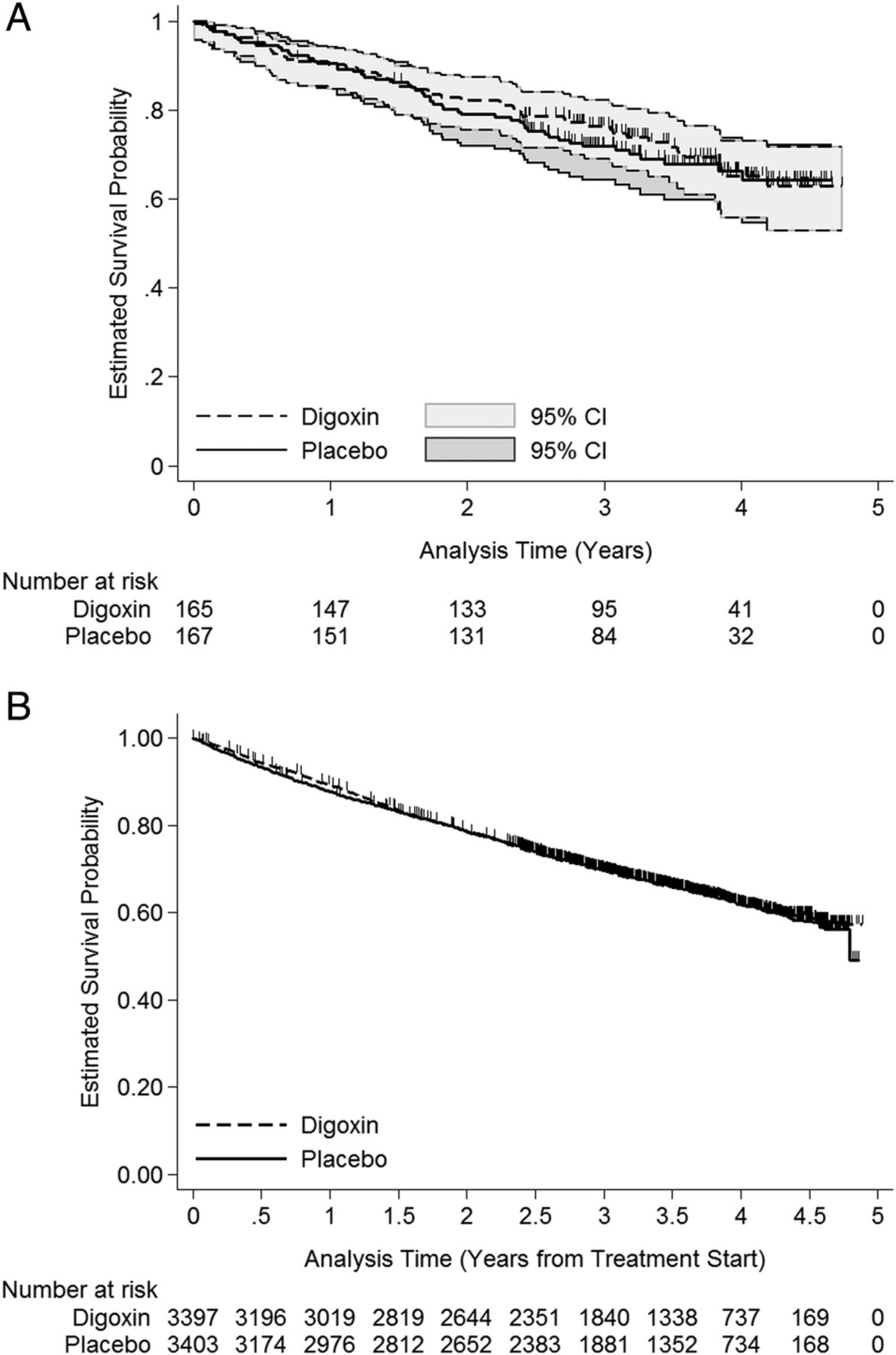
It is easy and informative to depict additional information regarding the survival experience on Kaplan-Meier graphs. Many statistical programs allow for censored observations to be indicated by vertical lines on the Kaplan-Meier curves. This option is presented in figure 2A for a random 5% subsample and in figure 2B for the full study population of the Digoxin clinical trial. The survival times represent time from randomisation to death from any cause. If the number of censored observations is large, as for the full sample (figure 2B), these markings can obscure the survival curves and any differences between them. Also depicted in figure 2A are pointwise 95% CIs. Both figures (figure 2A, B) also provide the number of individuals remaining at risk at various time points in a table underneath the graph. The choice of tick marks and labels for the horizontal axis will depend on the length of the study, but should include meaningful time points. For example, these might be yearly for a 5-year study and every 5 years for a study covering 20 years of observation. If the observation period is only 1 year, the labels might be chosen as monthly or bimonthly. We recommend including as detailed information as possible while maintaining easy readability. Because graphical illustration of the survival experience is more important than depicting censoring information, one compromise is to provide only the risk table underneath the graph and omit marks for the censoring times on the curves. This will help readers understand how many individuals are included from time zero and how many remain at risk over the observation period.

(A, B) Kaplan-Meier survival plots of probability of survival versus time for a 5% random subsample (A) and for the full study population (B) of the Digoxin trial including the number at risk at yearly (A) and 6-month (B) intervals and (for the subsample) 95% pointwise confidence intervals.
An alternative to indicating censored observations directly on the Kaplan-Meier curves is presented in figure 3, where the Kaplan-Meier plot for the Digoxin clinical trial includes a ‘rug plot’ at the bottom indicating the timing of the censored observations.

Kaplan-Meier curves for probability of survival versus time for the Digoxin clinical trial by treatment group with added censoring-time rug plots and including the number at risk at meaningful time points.
The choice of where to depict the censored observations (on or below the plot) is not important. What is important is that some censoring information be given without impacting the readability of the Kaplan-Meier curves. It is also important for readability to clearly distinguish and label any groups with different line types so that each can be identified when the graph is printed in black and white.
Cumulative incidence plot
Cumulative incidence plots are an alternative to Kaplan-Meier survival curve plots and show the cumulative probability that the event of interest has occurred over the course of the observation period.18 They are useful when the event of interest is rare, or when it is an event like disease incidence that will not occur for everyone even with the longest possible follow-up. When the event of interest is death or an event like ‘death or progression’ that will occur for everyone eventually, the cumulative incidence function is just 1 minus the Kaplan-Meier survival function. When the event of interest is an event like a specific disease incidence, that will not occur for everyone, a type of data sometimes called ‘competing risks’ data, a specialised function is required to assure that the sum of the cumulative probabilities of all possible events remains ≤1.19 In figure 4 we provide the cumulative incidence of first hospitalisation for MI, fatal coronary heart disease or death for four groups with different education in the Framingham Heart Study for participants who were <50 years of age at the time of enrolment.

Cumulative incidence curves for first hospitalisation for myocardial infarction, fatal coronary heart disease or death for four groups with different educational levels attained in the Framingham Heart Study for participants who were <50 years of age at the time of enrolment. GED, General Educational Development; HSD, high school diploma.
The main differences between a Kaplan-Meier survival curve and a cumulative incidence curve are that on a cumulative incidence curve, the value of the function at time zero is 0 (rather than 1), that it increases rather than decreases over time, and that the vertical axis scale is typically limited to the maximum estimated incidence.
We recommend that Kaplan-Meier plots be used unless curves are visually indistinguishable or there are competing risks.
Reproducibility of graphs and tables
The importance of reproducibility has gained increasing recognition in medical research.20–23 We believe research reports should provide enough detail about how the study was conducted in order that attempts to reproduce the research can be made readily by others. Another aspect of reproducibility considered here is one that has been discussed previously by statisticians:20–23 authors should provide data and software code to enable researchers to reproduce the statistics presented in the article. We acknowledge that the provision of complete data is sometimes not possible due to legal considerations or privacy concerns. However, we believe that detailed reporting requirements extend to the treatment of the data after they are collected, so that reports should provide the information needed to reproduce the results of all statistical analyses, graphs and tables included in a manuscript. Current opportunities for appending online material without page limitations mean that other information (such as which statistical software was used) can be provided without lengthening the printed manuscript. We believe authors should provide the statistical analysis software code that was used to arrive at the numbers and graphs reported in the manuscript in order that there is no question about what was done, so that readers with access to the data could use this code to reproduce all numbers and graphs in the manuscript. To promote this type of detailed reporting and to enable reproducibility of the graphs and tables presented in this manuscript, we provide sample code for both R and Stata as online supplementary material .
supplementary data
supplementary data
supplementary data
supplementary data
supplementary data
Conclusion
Despite some progress toward clear reporting of statistical analysis and results in medical journals, improvements can still be made. In this article, we have provided recommendations for tabular and graphical representation of censored survival data. We strongly believe that clearer, more complete reporting and provision of statistical code will provide an important step in improving the generation and reproducibility of new knowledge.
References
Footnotes
Contributors Both authors participated in the writing of this manuscript.
Competing interests None declared.
Provenance and peer review Commissioned; externally peer reviewed.